A UX case study for a group travel planning and productivity solution made easy through an all-in-one mobile app.
About WePlan
WePlan simplifies group travel, making it easy, enjoyable, and stress-free. The interactive app engages users in planning, encourages collaboration, and keeps trip details organized and accessible for everyone.
Our Contributions
This self-initiated student project at Coursera began as a small idea and grew into a validated concept. Through in-depth user research and data insights, Krista designed the product end-to-end on her own.
the problem
Planning group trips is often messy and inefficient. Young professionals juggling busy schedules and living in different cities rely on scattered group chats and platforms, where important details easily get lost, causing confusion, frustration, and disorganization.
User Interviews
To get to the core of the problem, Krista conducted (3) interviews about their existing travel behaviors - then used the affinity wall method to analyze. Some key topics she touched were:
Who they travel with, specifically in groups
Balancing work, lifestyle, and travel
Types of resources used for travel planning
Frustrations and joys while planning a group trip
Coordinating trip expenses
Key takeaways: User Frustrations
Lack of contribution
Messy organization
Bad communication
Inefficient cost of splitting
Busy lifestyles
Too many platforms or texts in group chats
Competitive Analysis
After analyzing competitors, Krista concluded with these key takeaways that helped me narrow the app's features:
Maintain a good balance between a minimal and busy interface.
Enhance the immerse experience by presenting subtle onbooarding animations, interactive tips and queues.
When splitting expenses, create a manual option as most groups do not split costs equally
Users are motivated to contribute and help their group plan upcoming trips
Organize
Ease the stress of planning and coordinating with arranged structure and easily accessed groups schedules, flight arrivals, and accommodations details
Social Interaction
Encourage users to interact with friends
Multi-concept
Coordinate and simplify multiple features all in one app
Building Empathy
After leveraging insight and qualitative data from user interviews, Krista created personas to better relate with main user groups and their goals.
Sarah
demographics
Age: 26 Occupation: Travel & Brand Influencer Location: New York, NY Life Stage: Engaged, no children
motivators
- Planning an upcoming wedding - Partnerships - Simplify travel planning - Providing travel tips & tricks - Community & many friends
constraints
- Busy work life and limited time - Her friends are planning a very disorganized and chaotic bachelorette trip - Concerned friends and other influencers won't stay engaged before a group trip - Her friends don't have an efficient way of splitting costs for the bachelorette trip
Dan
Demographics
Age: 30 Occupation: Photographer Location: Seattle, WA Life Stage: Single, no children
motivators
- Independence - Collaboration - Hiking, outdoors, and exploring new destinations - Itinerary planning - Social contact & meeting new people
constraints
- Finds himself planning group trips on his own - Doesn't have time to update others on itinerary details - Needs a secure and efficient way to share photos and documents - Concerned with communication as the people he collaborates with don't enjoy group chats or check email promptly
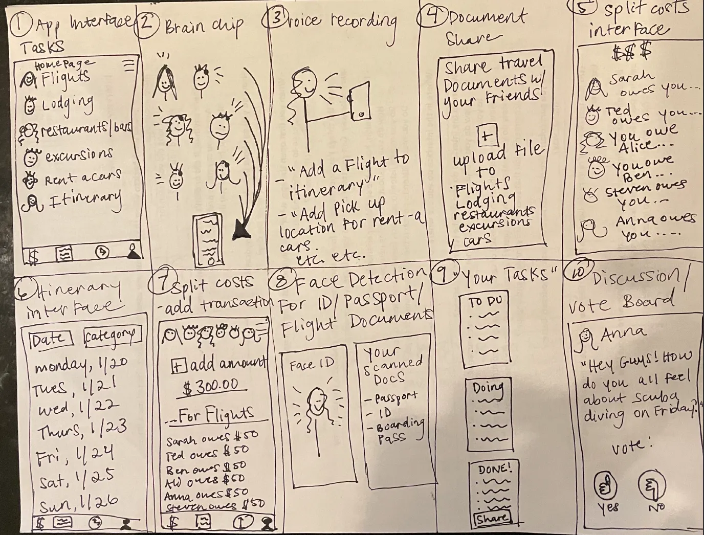
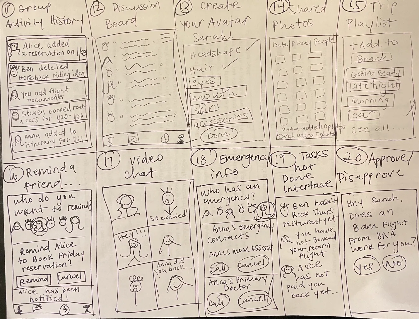
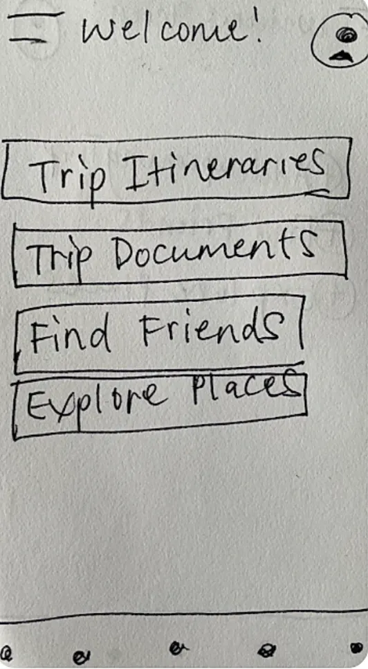
Ideate
Sketching quickly, Krista brainstormed ideas and layouts.
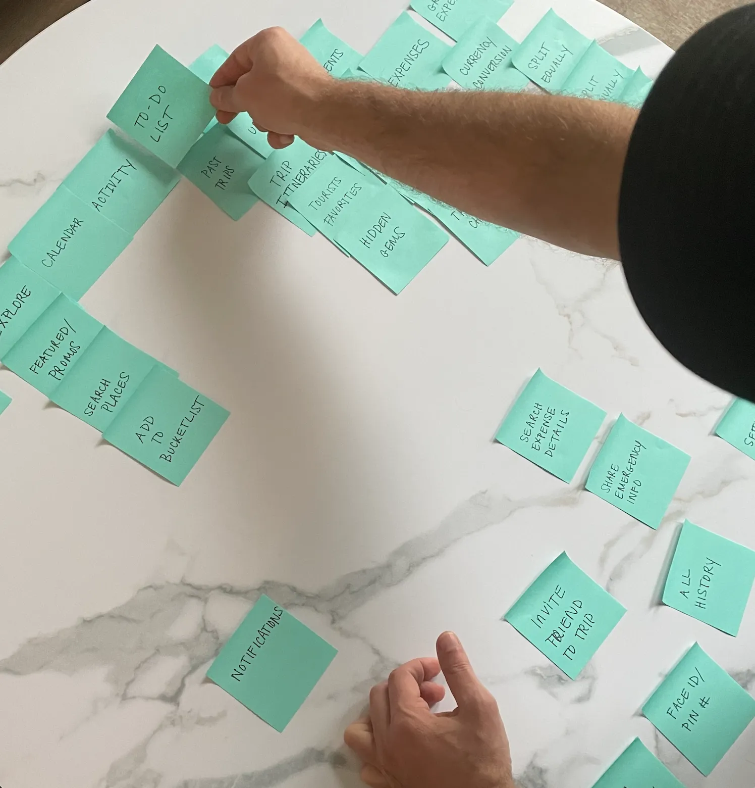
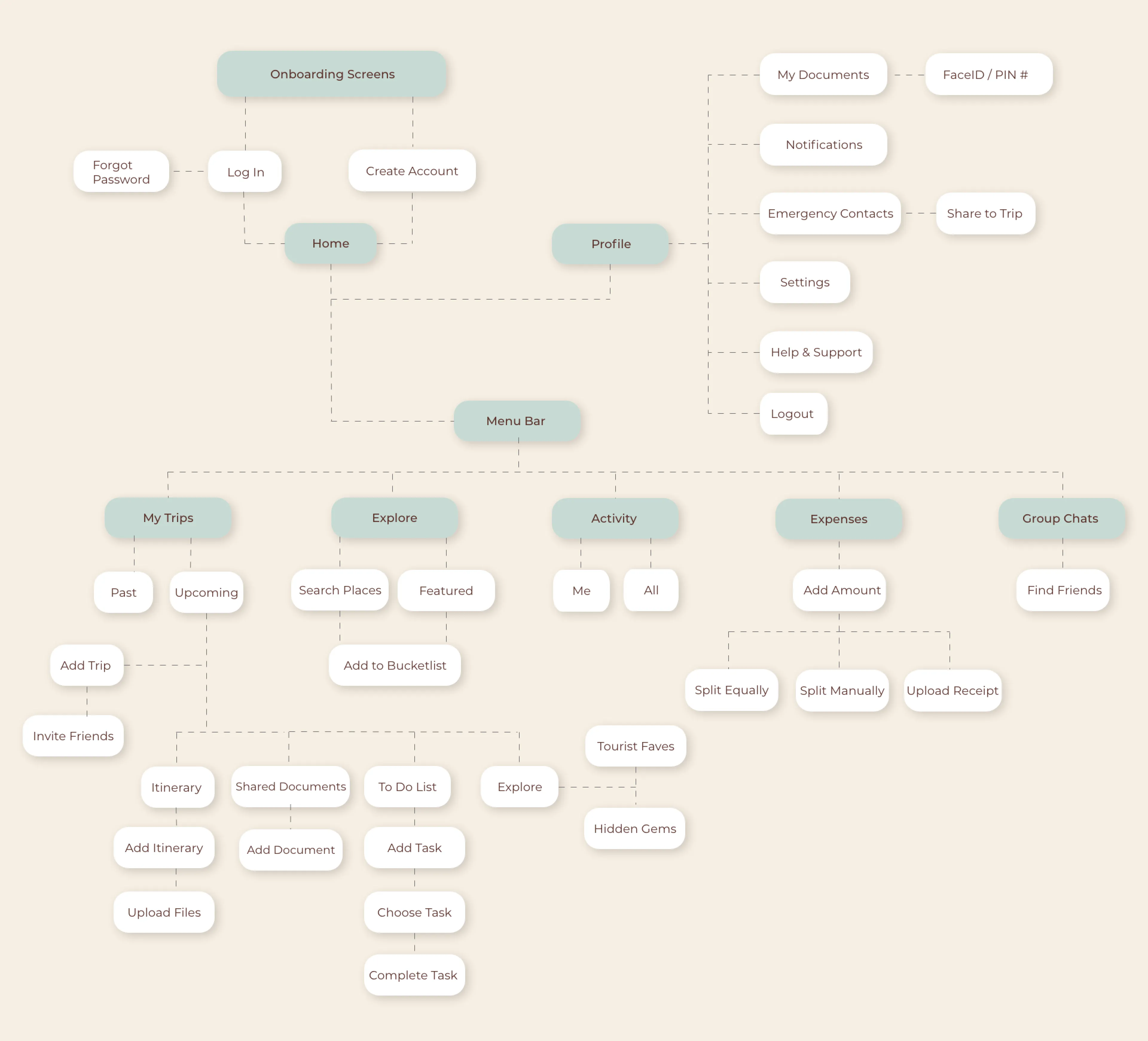
Information Architecture
Krista conducted the Card Sorting Method and asked (4) people to group words associated with the app into categories that made sense to them. She concluded with the happy path below.
Input & Output Wireframes
Inputs
Outputs
Lo-fidelity prototype & User Testing
Krista recruited (3) participants who fit the criteria to test her prototype early before starting the hi-fi design. After collecting user feedback, she made some navigational changes.
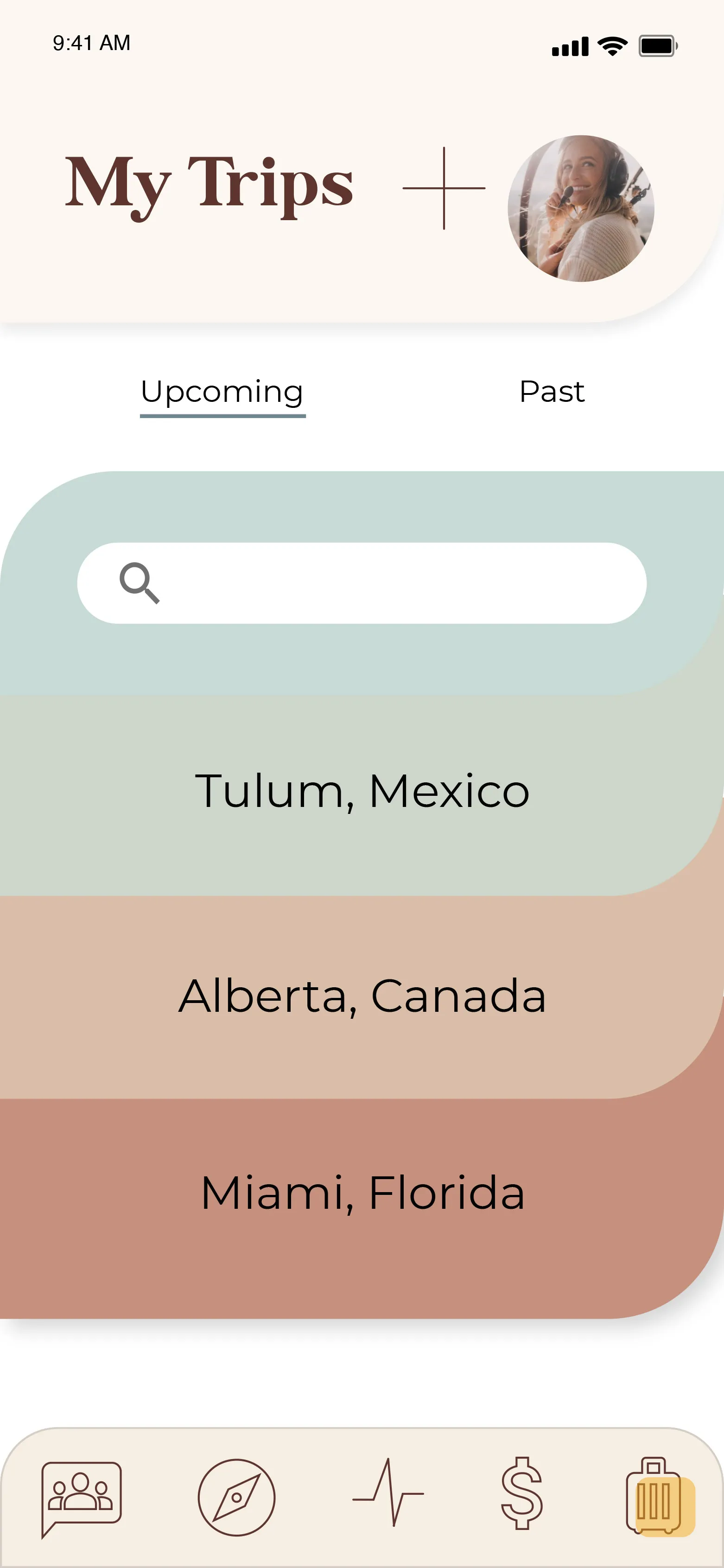
The Problem
Users were having a difficult time finding "My Trips", because it was within an unexpected main tab - Itineraries and documents
The user would then access ALL itineraries of ALL trips, instead organized BY the trip
The Solution
Moved "My trips" to the homepage and as a call to action where the user will then find itineraries and documents organized within each dedicated trip
UI Style Guide
Earthy, fun, inviting, colorful palette with modern retro font and customized icons.
Color
Primary
#cdd5CA
#C5907E
Secondary
#964C33
#F6E1AA
Tertiary
#5D352E
#D9BEA8
Neutral
#FFFFFF
#F6EEE3
Success
#9fb483 - op 25%
#9fb483
error
#c24936 - op 25%
#c24936
Typography
Chalmers
Aa Bb Cc Dd Ee Ff Gg Hh Ii Jj Kk Ll Mm Nn Oo Pp Qq Rr Ss Tt Uu Vv Ww Xx Yy Zz Regular, Bold
Montserrat
Aa Bb Cc Dd Ee Ff Gg Hh Ii Jj Kk Ll Mm Nn Oo Pp Qq Rr Ss Tt Uu Vv Ww Xx Yy Zz Regular, Bold
Customized Icons
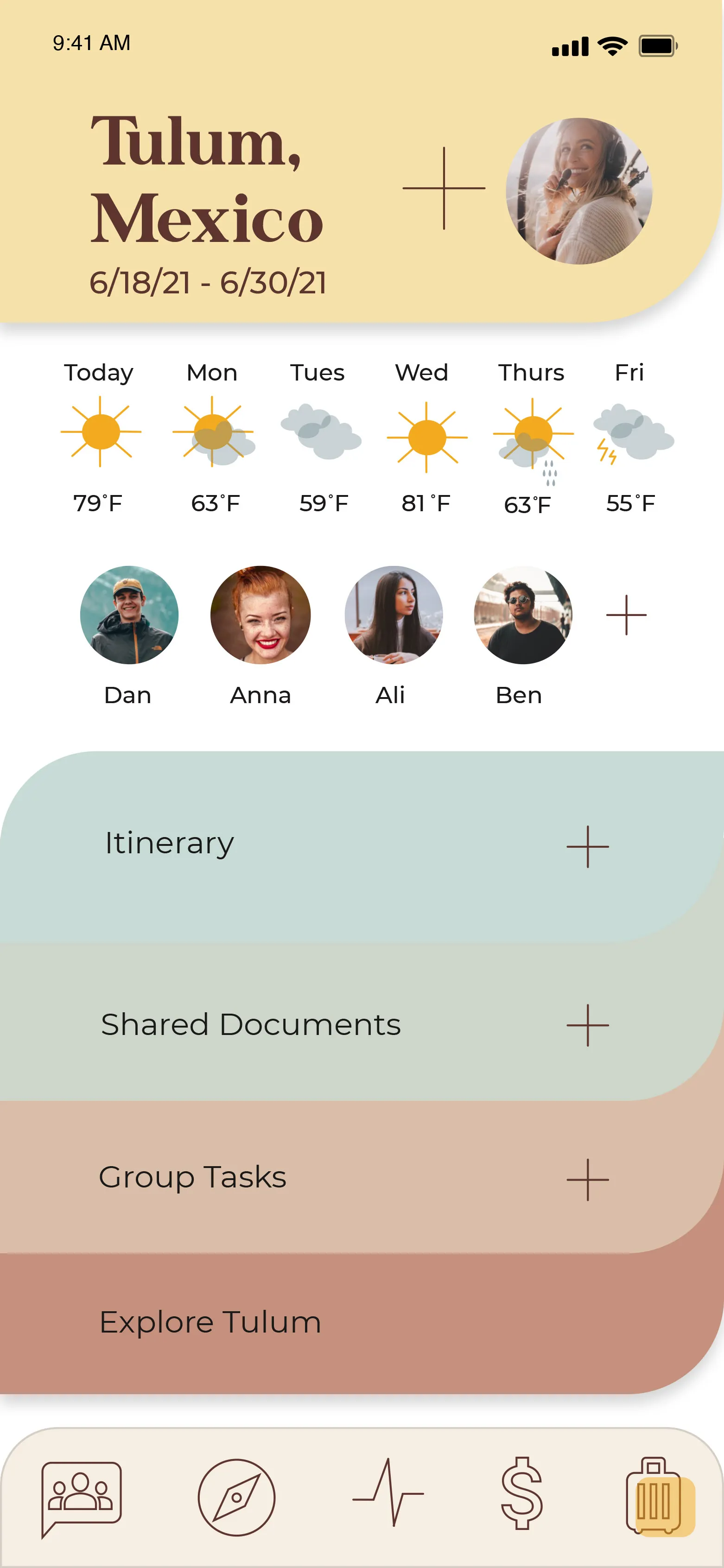
Hi-fidelity design
Visual design concept: Krista wanted to design with filing tabs - giving the sense of organization
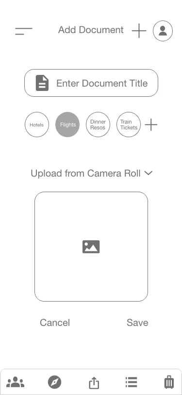
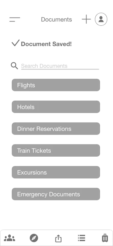
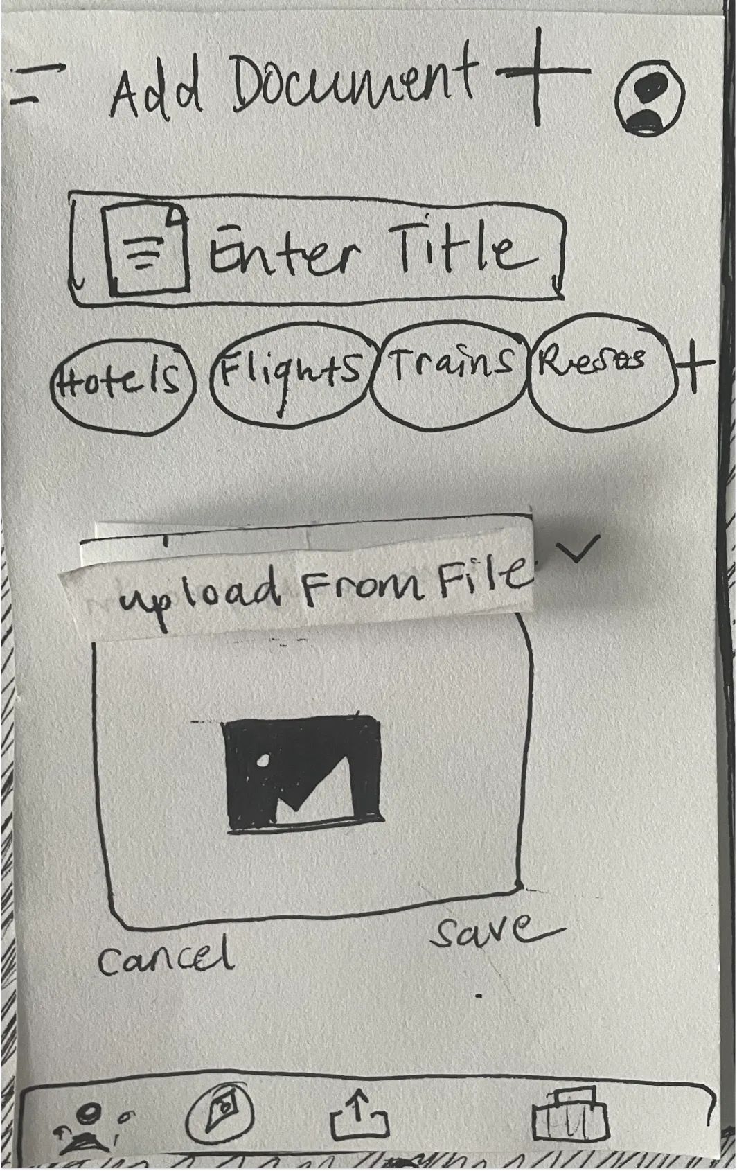
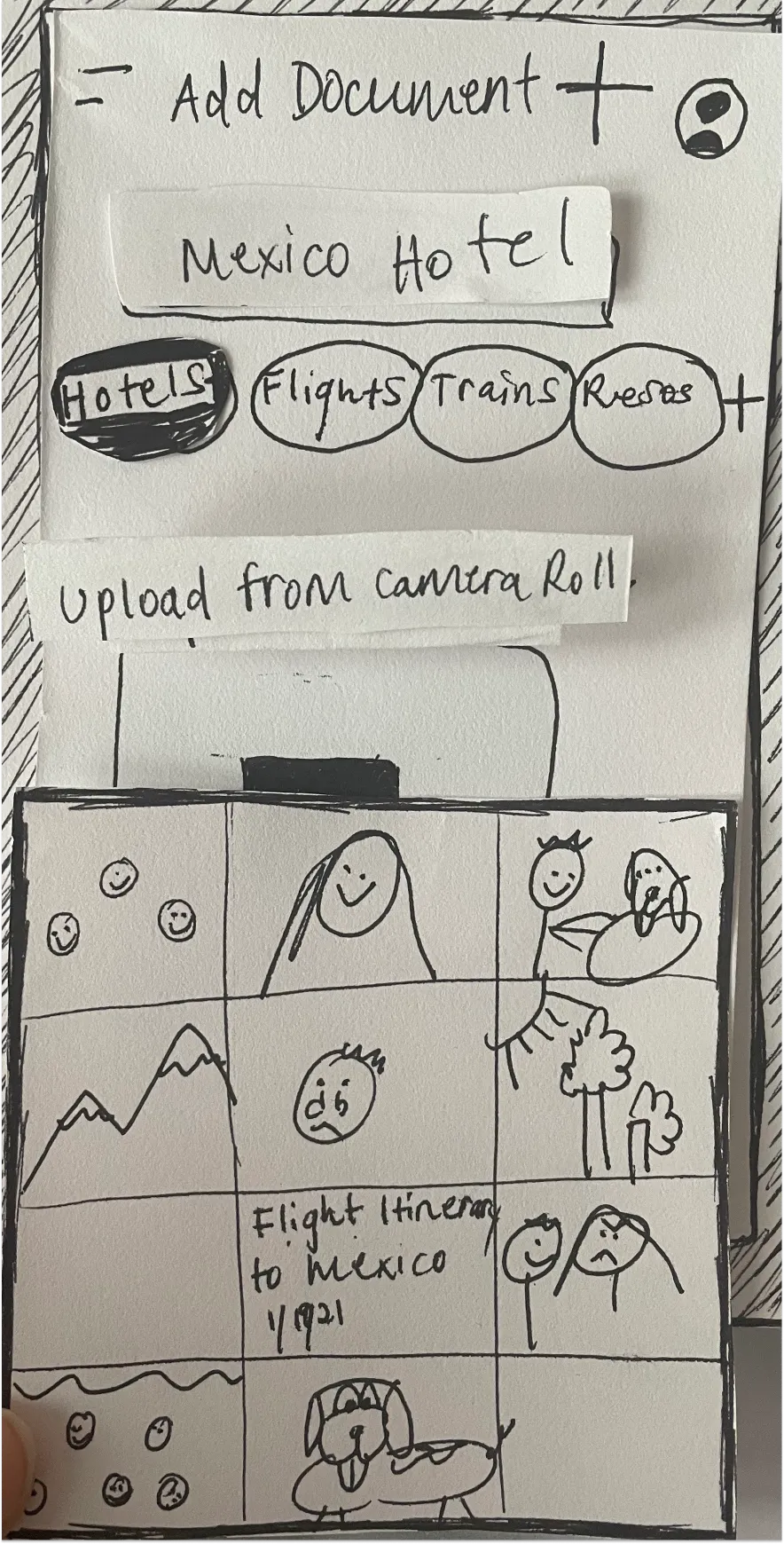
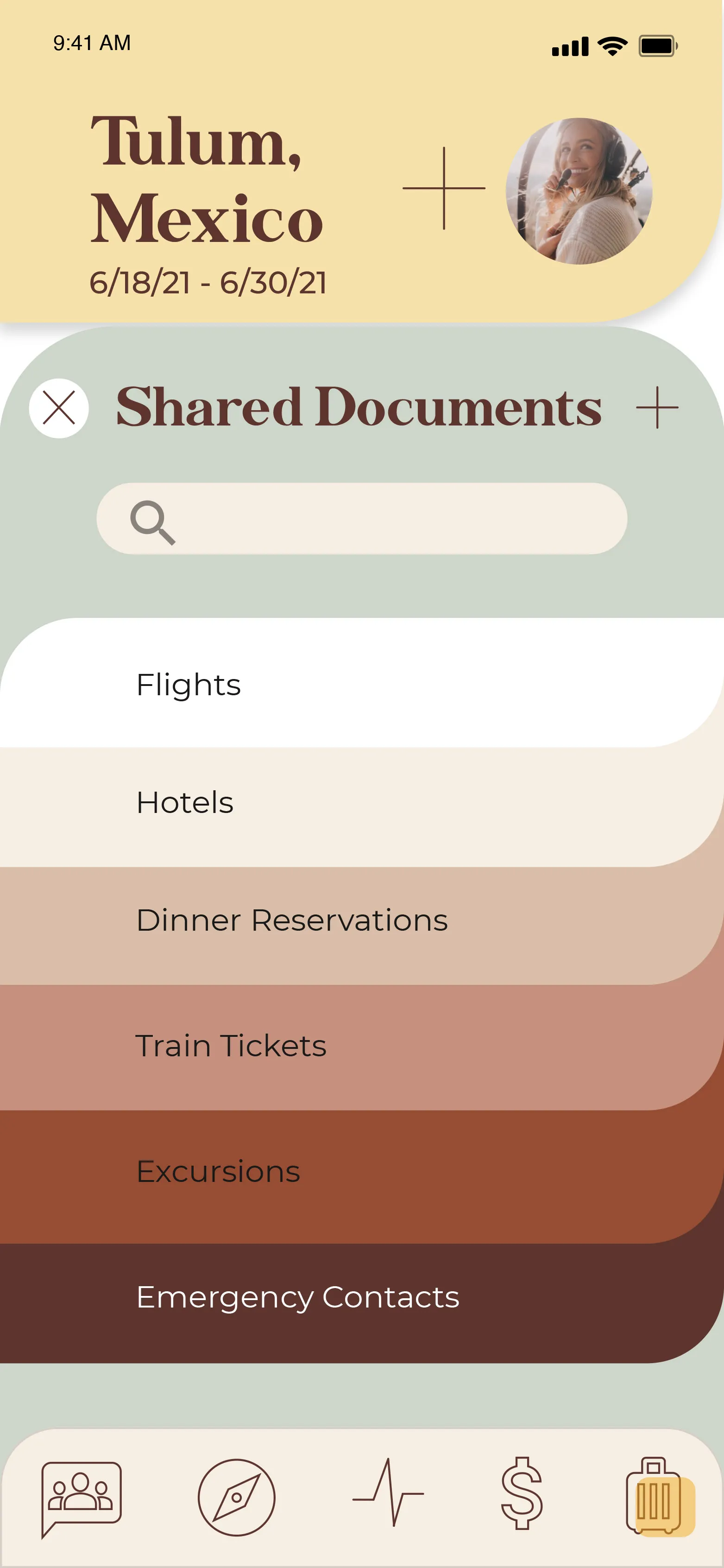
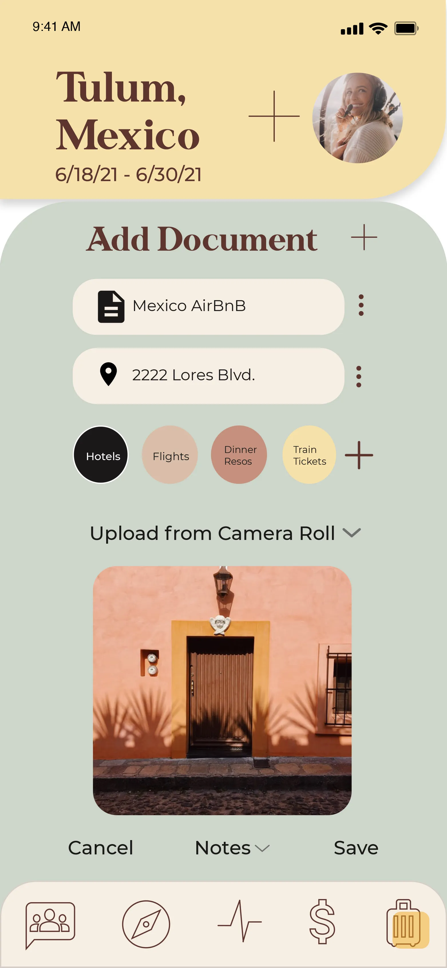
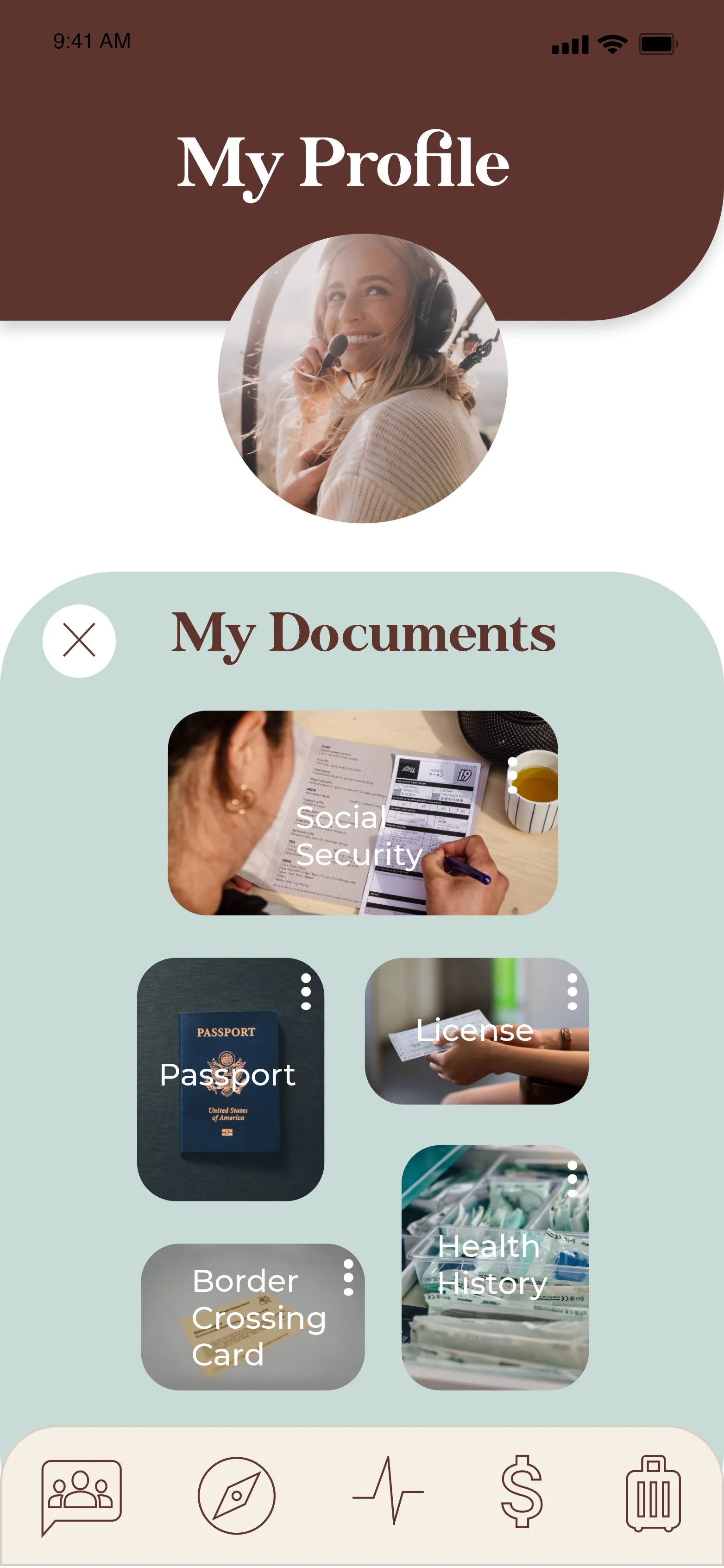
Shared Documents
Groups often travel from different cities to meet at a destination
Groups tend to separate during trips
Shared documents allows a smooth information exchange. Documents are uploaded, shared, and stored for everyone to access at anytime.
Reduces confusion, bad communication, and bad organization - keeping everyone on the same page
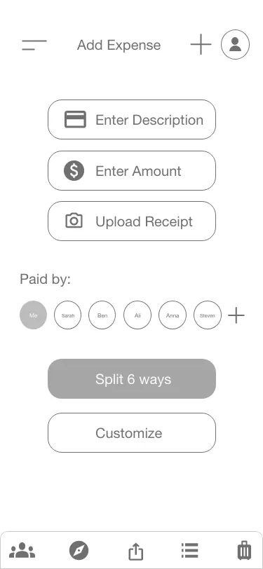
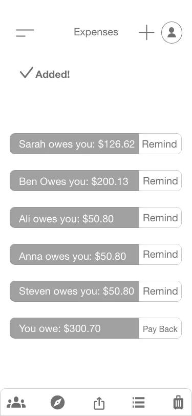
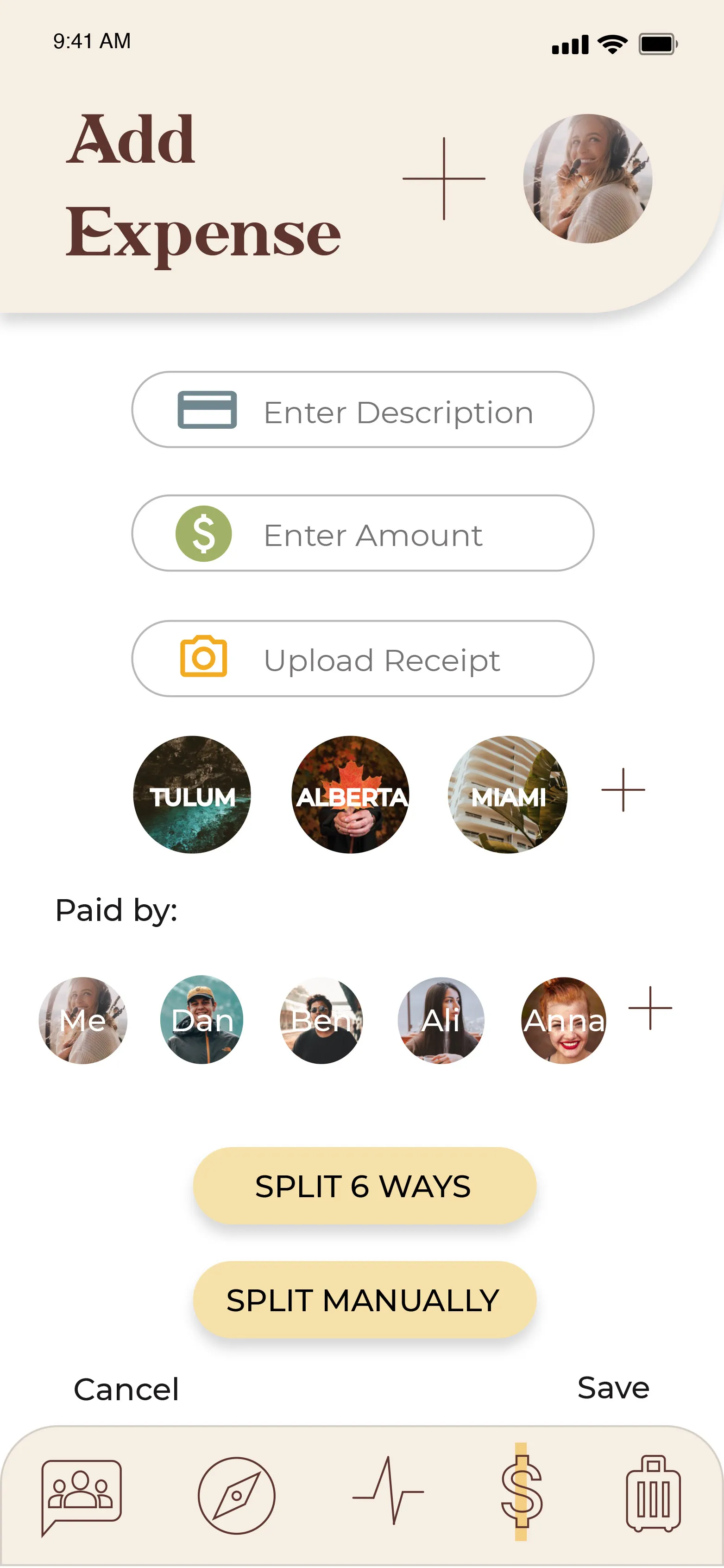
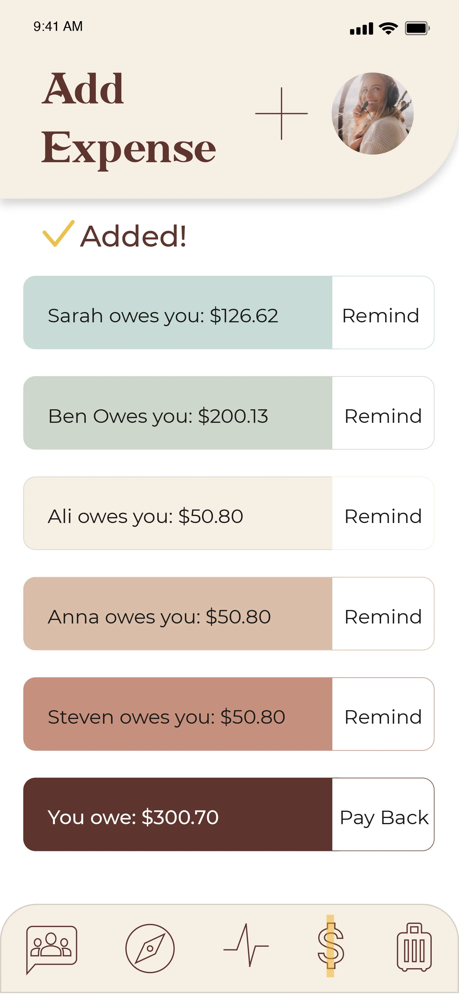
Splitting Expenses
Not all costs are split equally
Fairness & Accuracy: users have freedom to choose which friends are involved in an expense, reducing discrepancy or misunderstandings
Manual and accurate split costs are transparent and hold people more accountable when there is less a chance to disputes
System gives feedback when expense is logged
User can easily view what is owed from each friend and what needs to be paid back to others
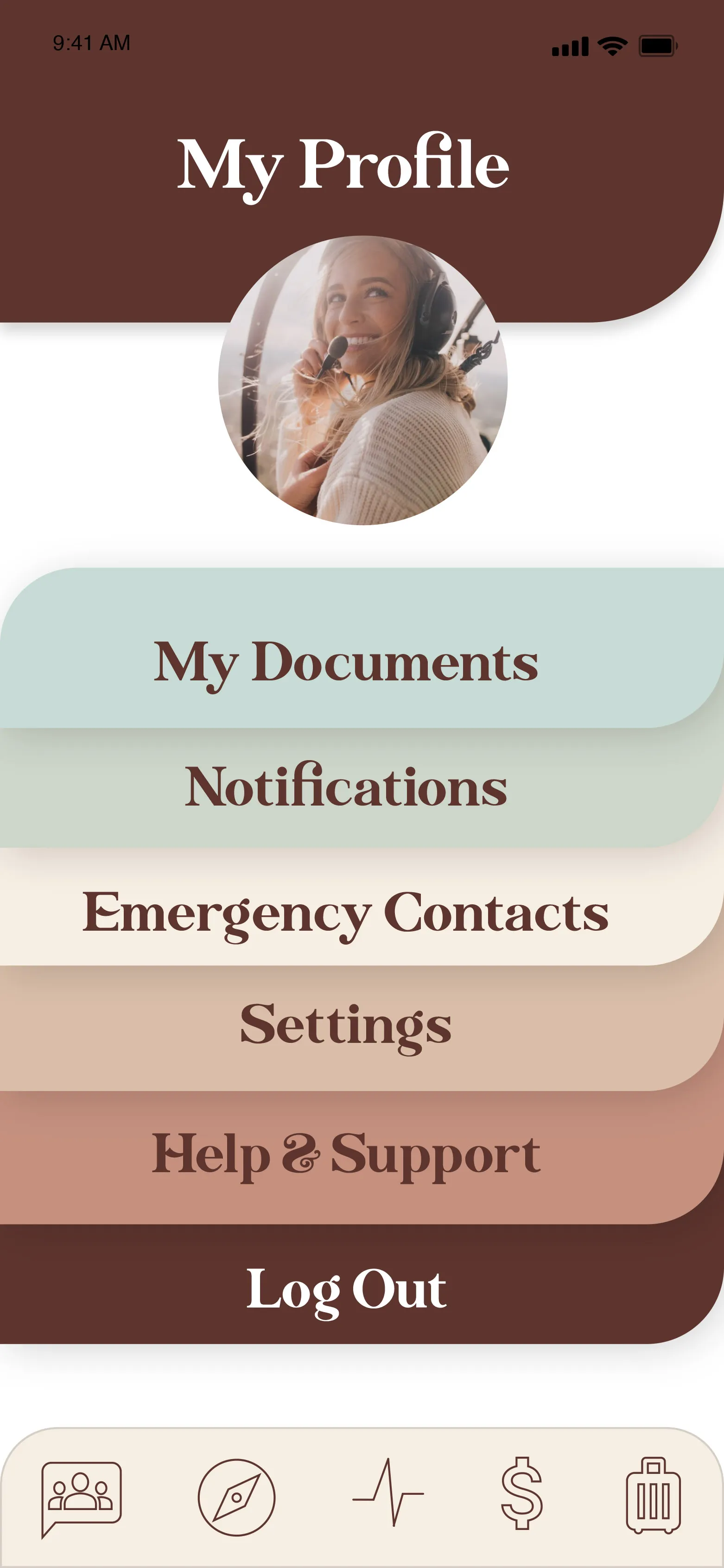
My Profile
To access sensitive documents, a FaceID or Pin # is required
User has the option to share certain documents with a designated grooup or individual
Interaction Design
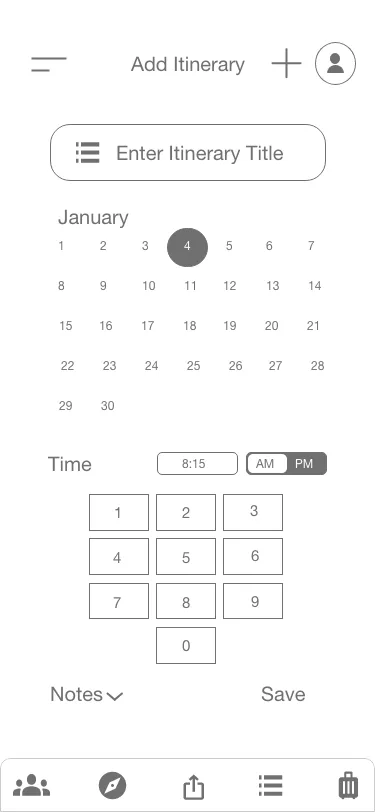
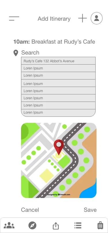
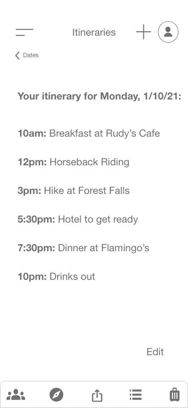
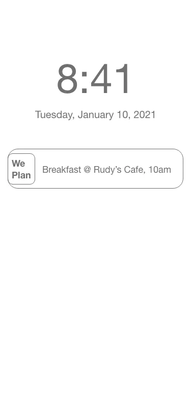
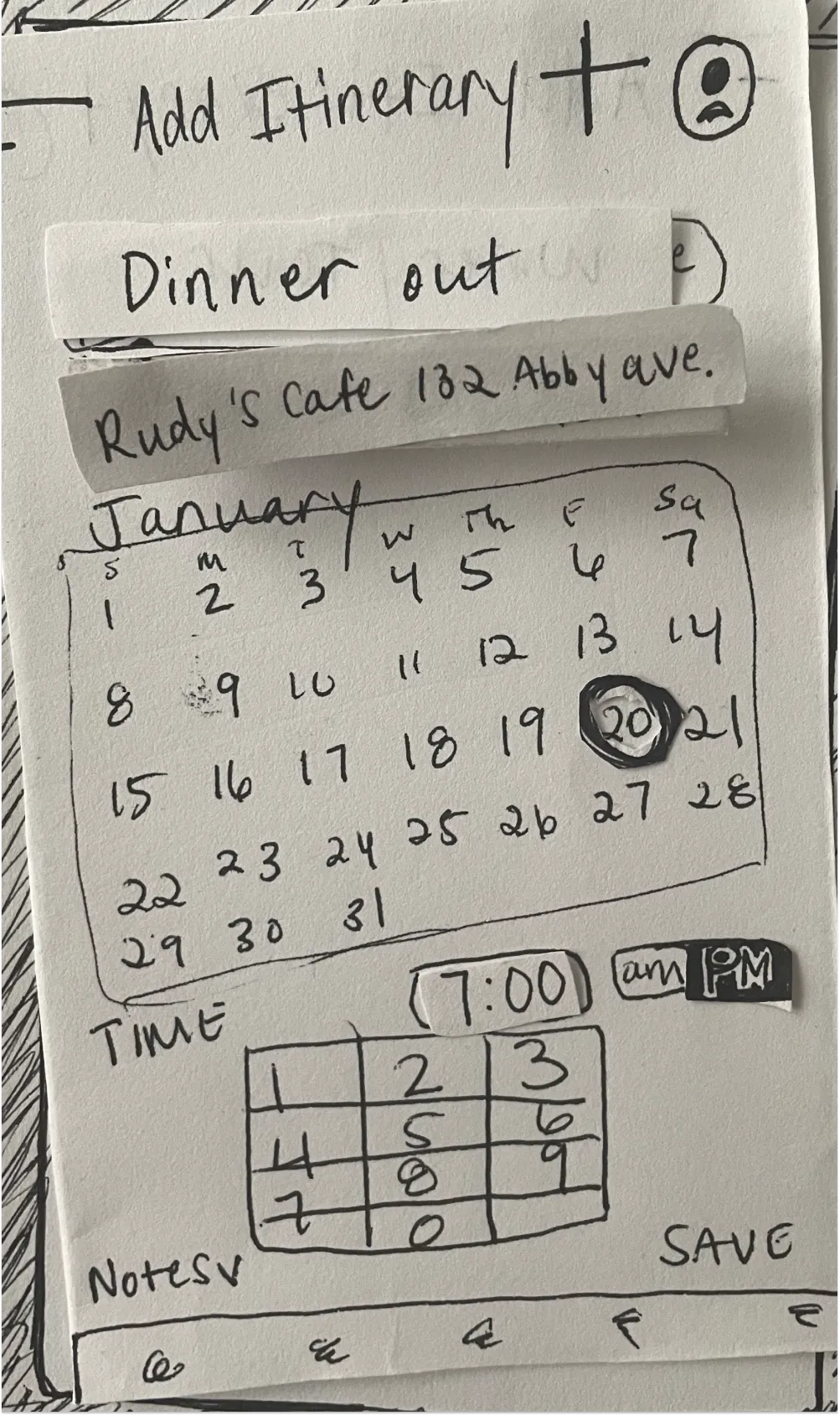
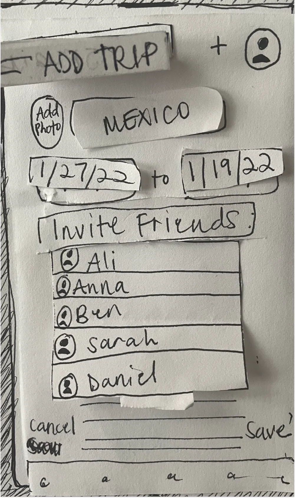
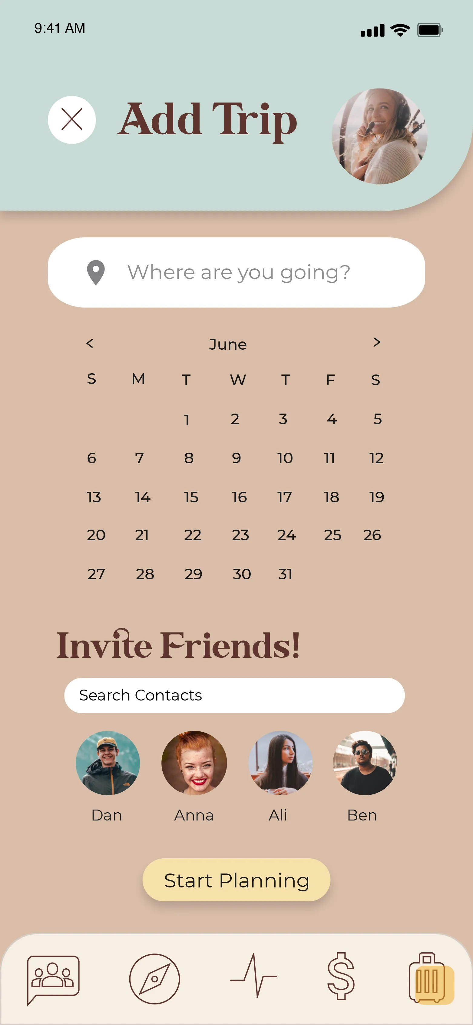
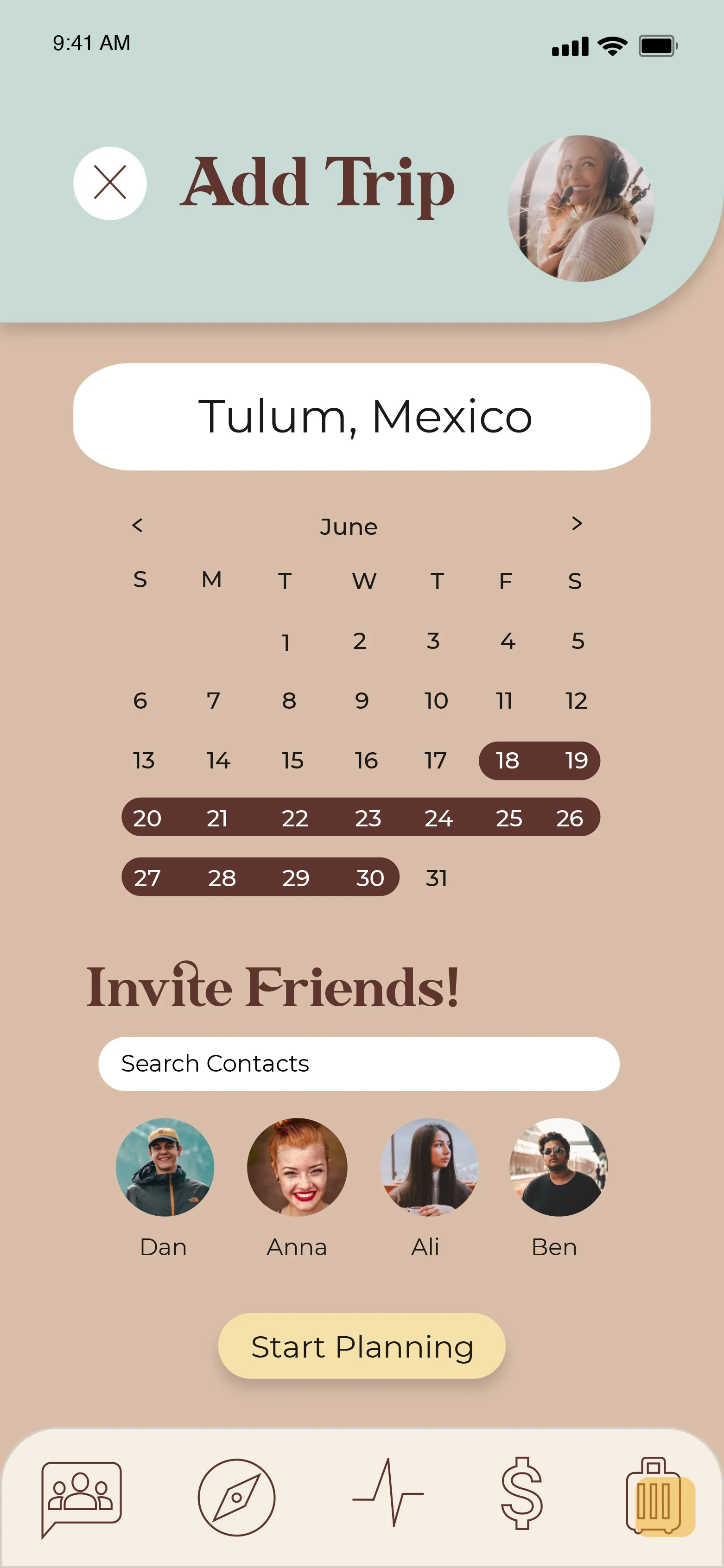
Itinerary flow
Iterative solutions
Team Effort Planning
Friends are encouraged to create and complete planning tasks together
The Problem
Navigation to transition between incomplete vs. completed tasks = more clicks and redundant
Cluttered interface and colors don't feel cohesive
Incomplete tasks are not seen at the top of the list
The Solution
Removed transition feature and simplified all tasks on one screen
When task is completed, system gives feedback by making task inactive and moving to the bottoom
Colors are united and interface cleaner
User has control & freedom to click (3) dots to edit, undo, or share tasks
.svg)


%201.webp)