Woman enjoying life
Consumer dashboard
Willow Inc.
ux/ui | b2c | web app | Mobile & desktop

Overview

A platform helping the new majority of investors identify, prioritize, and achieve goals by providing life journey support

About Willow

Willow is redefining financial advice for women, NextGen, and underrepresented investors, by matching them with trusted, CE-certified advisors who truly connect with them. Willow’s matching system ensures investors are paired with advisors who resonate on a personal level and meet the unique needs of today’s diverse clientele.

Our Contributions

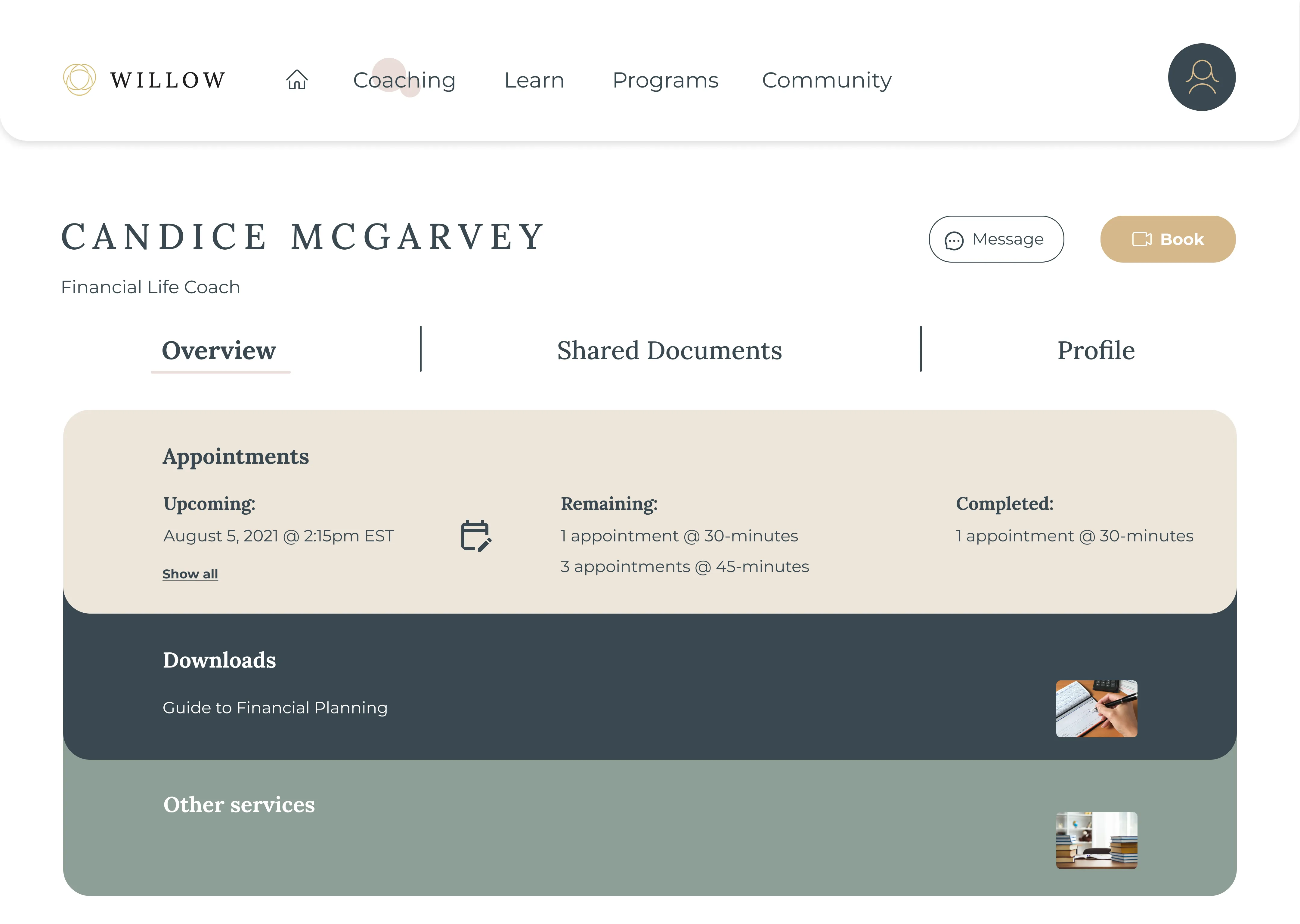
As the sole UX/UI Designer, a significant accomplishment was spearheading the design process for the Consumer Dashboard, taking it from initial conception to prototype.

Collaborating with the Chief Product Officer (CPO), Krista contributed innovative ideas and practical solutions to improve user experience design and information architecture by creating user journeys, sketches, wireframes, and mock-ups.

We took full ownership in crafting visually appealing, intuitive interfaces, and designing engaging interaction experiences. Krista's contributions as a UX/UI Designer have made a meaningful impact on Willow's overall success.

01
the problem

Financial Advisor with client
Women and underserved communities are the new majority of investors. However:
Sad face icon
73% of women are dissatisfied with their financial advisor.
Sad face icon
70% of NextGen clients feel advisors don’t take time to get to know them
Sad face icon
63% of LGBTQ+ clients feel advisors don’t understand their financial challenges
Sad face icon
Financially stressed and distracted workers lead to a greater number of sick days, increased absenteeism, and higher healthcare costs.
02
Design Solutions

Coaching & Training

Create a platform that offers real life guidance for key moments in life to individuals

Progressive Benefits

Partner with businesses and help them support their employees

Advisor Certification

Connect individuals with advisors whom Willow trains and certifies to better serve clients of these communities
Continuum
Consumer Dashboard DesignMobile Design

03
Ideation

Ideation
Our approach always begins with a user-centric perspective. We thoroughly analyze the user's pain points, desires, and the problem space. Equally important is discussing business objectives and technical constraints at the project's outset to ensure alignment and a shared vision.

Once the CPO of Willow conducted user research and developed a rough site map, we received general requirements to refine.

Utilizing several sketches, we iteratively updated the site map and delved deeper into crafting the information architecture, particularly for the homepage and dashboard navigation.

04
Wireframes

A few (of many) screens below that were tested and went through several iterations.
Mobile Wireframes
Mobile Wireframes
Mobile Wireframes
Mobile Wireframes

05
UI Style Guide

Color

Primary
#394950
#d6b88b
Secondary
#8d9f97
#748386
Tertiary
#eaddd9
#3f5873
#777a69
Neutral
#FFFFFF
#e9e9e9
#ece5da
#c1baaf
Success
#9fb483 - op 25%
#9fb483
error
#c24936 - op 25%
#c24936

Typography

Lora
A B C D E F G H I J K L M N O P Q R S T U V W X Y Z
R E G U L A R
Aa Bb Cc Dd Ee Ff Gg Hh Ii Jj Kk Ll Mm Nn Oo Pp Qq Rr Ss Tt Uu Vv Ww Xx Yy Zz
Regular, Bold
Montserrat
Aa Bb Cc Dd Ee Ff Gg Hh Ii Jj Kk Ll Mm Nn Oo Pp Qq Rr Ss Tt Uu Vv Ww Xx Yy Zz
Regular, Bold

Button States

Button design states

Iconography

Iconography

06
Hi-fidelity design

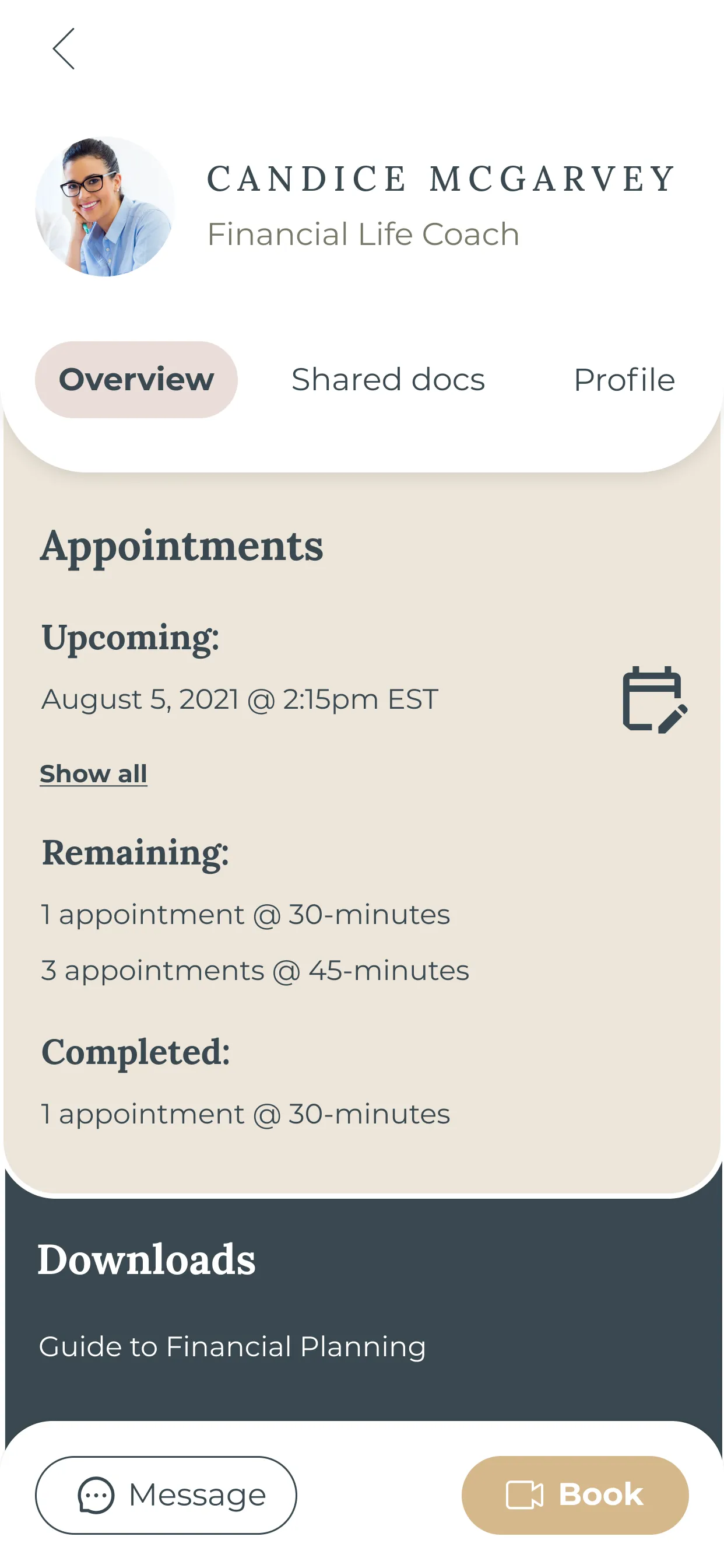
Mobile hi-fidelity design

07
Interaction Design

We designed interactive forms to make the courses and goals more enjoyable - decreasing abandonment and incompletion rates.

08
Iterative solutions

Strategic design thinking and iterations helped us bring life to sensible and functional user flows. We created intuitive and engaging UX solutions that lead the user to frequent the app and book appointments with financial life coaches. This all-around benefits all stakeholders - the individual, employers, Willow's business, and Willow's life coaches.

The Homepage

Before Design

The Problem

Sad face icon
Too busy, overwhleming, and cluttery
Sad face icon
Booking appointments & engaging with coaches are most important call-to-actions and should be evident on homepage
Sad face icon
Users were not comprehending "Journey" as clear
Consumer Dashboard Mobile Homepage

The Solution

Lightbulb icon
Appointments & Care team are made call-to-actions, benefiting the user, employers, coaches, and Willow
Lightbulb icon
Added a Profile button with notification center of upcoming reminders
Lightbulb icon
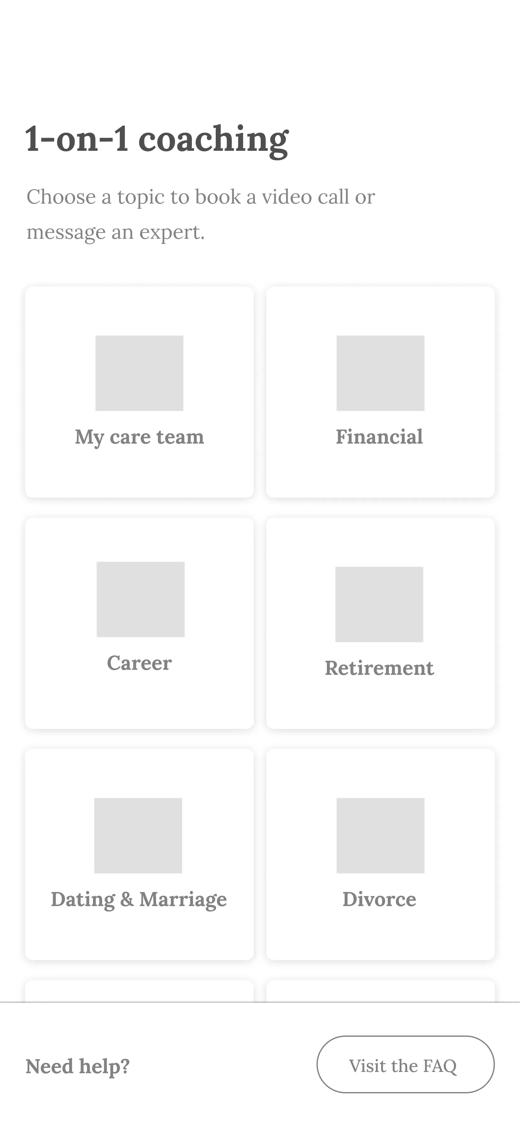
To avoid overlapping nav confusion, moved 1-on-1 coaching under "My Care Team"
Lightbulb icon
Changed "My Journey" to "My Progress" for a better understanding that this section allows resources and tracking for growth accessible.

The Learning Center

We found that the bounce rate was high and people were dropping off before making it to an article, a video, or signing up for a course.
Learning Center User Flow Before

The Problem

Sad face icon
Required too many clicks before making it to an article (4+ screens)
Sad face icon
Left nav is overwhelmed with several tabs
Sad face icon
Underwhelming interaction design resulted in minimal engagement
Sad face icon
UI: spacing is off and in desperate need of a grid system
Learning Center Iterative Design

The Solution

Lightbulb icon
Implemented the Law of Familiarity and simplified flow with magazine-style layout
Lightbulb icon
Replaced left nav with a simplified and intuitive top nav and UX flow
Lightbulb icon
Drastically reduced clicks and back button fatigue. User can browse all on one page
Lightbulb icon
Mega-menu with subcategory drop down when hovered over main categories

Find a Coach

After shipping the Consumer Dashboard, a lot of useful data, analytics, and insightful feedback was collected.
Find a Coach Flow Before

The Problem

Sad face icon
People were dropping off before booking a session with financial life coaches - at the beginning of the flow
Sad face icon
User flow was tedious and too drawn out
Sad face icon
Back button fatigue

The Solution

Lightbulb icon
We reduced and simplified the amount of screens and clicks by creating - expand and collapse - hamburger button interactions. Users now have flexibility and efficiency to view and close multiple subcategories within each category all on one screen
Lightbulb icon
To guide and help users choose and book a coach quickly, we suggested that profiles should algorithmically display specific skills and specialties that are relevant to the chosen subcategory
Lightbulb icon
With the same - expand and collapse solution, users can browse and compare multiple coaches, choose and schedule all on one screen

09
Reflection

Data & feedback is valuable
We were reminded that although it can be discouraging or disheartening to receive negative feedback, that there is always room for improvement. This project made us think outside of the box, and we had the opportunity to challenge ourselves and our design thinking.
Iteration is everything
Reflecting on this project highlighted the importance of iteration design and keeping up with UX design trends. An iterative process not only satisfies the user, but also converts!
Consider all stakeholders
When brainstorming features, we always advocate for the user. But keeping business objectives and technical constraints in mind helped the process.
back to top

explore More projects

A mockup of multiple mobile phones displaying the various screens of an app design

WePlan: Travel App

An all-in-one mobile app that solves the burdening of confusion and disorganization of group traveling
An ipad mockup of Willow's website hero section

B2B & B2C Website

Partnering to grow business by supporting the new majority of investors