.svg)


Environmental Brand Strategy & Identity
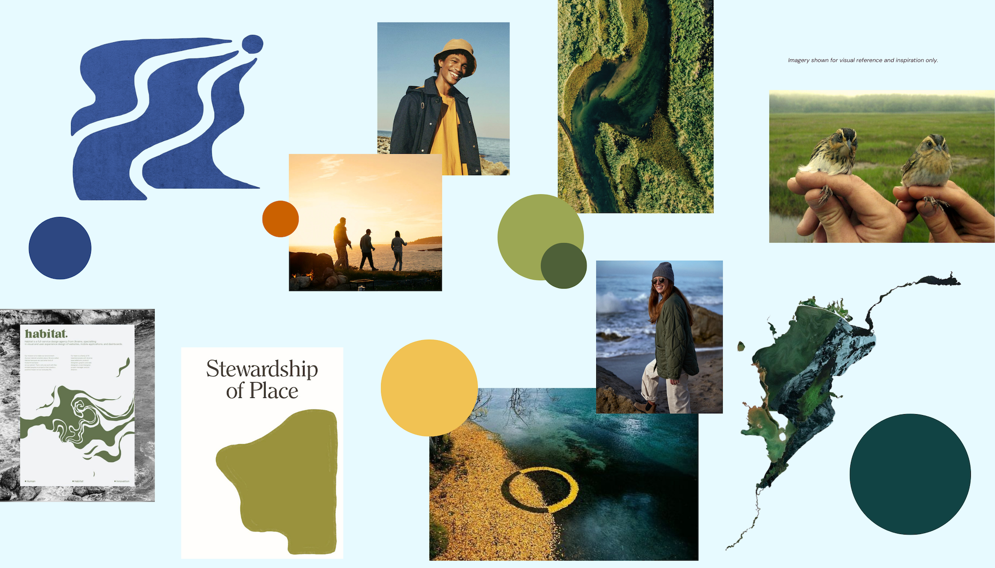
In partnership with Grimm & Grove Communications, Elliworth led the visual refresh for Casco Bay Estuary Partnership (CBEP), a regional organization dedicated to protecting Casco Bay and its watershed. As CBEP expanded its focus on climate resilience and water-related challenges, the brand needed to better connect with broader and underserved audiences while clearly distinguishing its role among partner organizations. Together, we developed a refreshed, accessible identity system that reflects CBEP’s mission, strengthens recognition, and supports consistent communication across internal and external touchpoints.


Working alongside Grimm & Grove’s research and messaging strategy, we began with a visual audit to identify opportunities for clarity, differentiation, and cohesion.
The refresh focused on approachability, accessibility, and clearer differentiation within a network of partner organizations. The updated identity draws from the natural landscape through earthy tones, organic forms, and subtle map textures that evoke place. Refined typography and improved color contrast enhance usability across mediums. A comprehensive brand guide, reusable templates, and a structured rollout plan ensured consistency and a smooth transition.


.avif)


