.svg)

Heart-Led Screen Printing Brand & Web Design
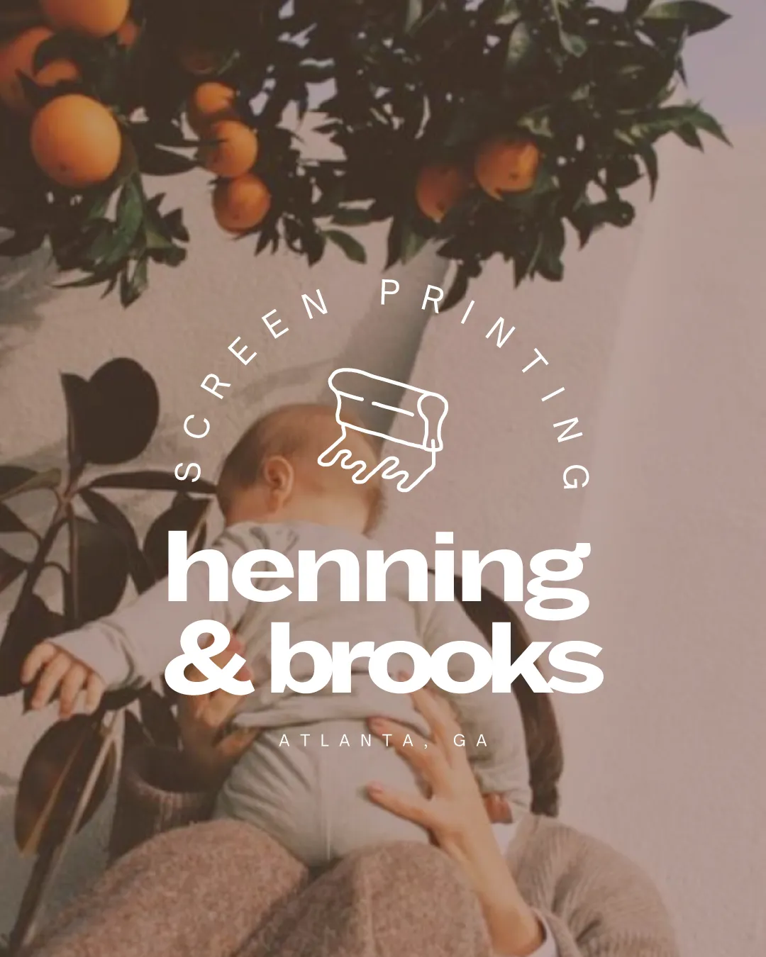
Henning & Brooks is a husband-and-wife owned screen printing studio rooted in family values and hands-on craftsmanship. Built from a passion for creativity, integrity, and service, the brand blends direct-to-consumer accessibility with a strong sense of personality. Elliworth partnered with the founders to create a distinct identity and website that reflect both their artistry and their family-driven foundation.
.webp)
.avif)
The identity leans into warmth and character, positioning screen printing as both craft and art form. We developed a visual system that feels wholesome and personable while still standing out in a competitive local market. Custom, hand-drawn elements introduce a playful layer that reflects the founders’ story and sets the tone for a more personal, creative experience. The website carries this energy forward through clear structure and approachable messaging, making the brand feel both professional and inviting.

.avif)


.avif)

