.svg)
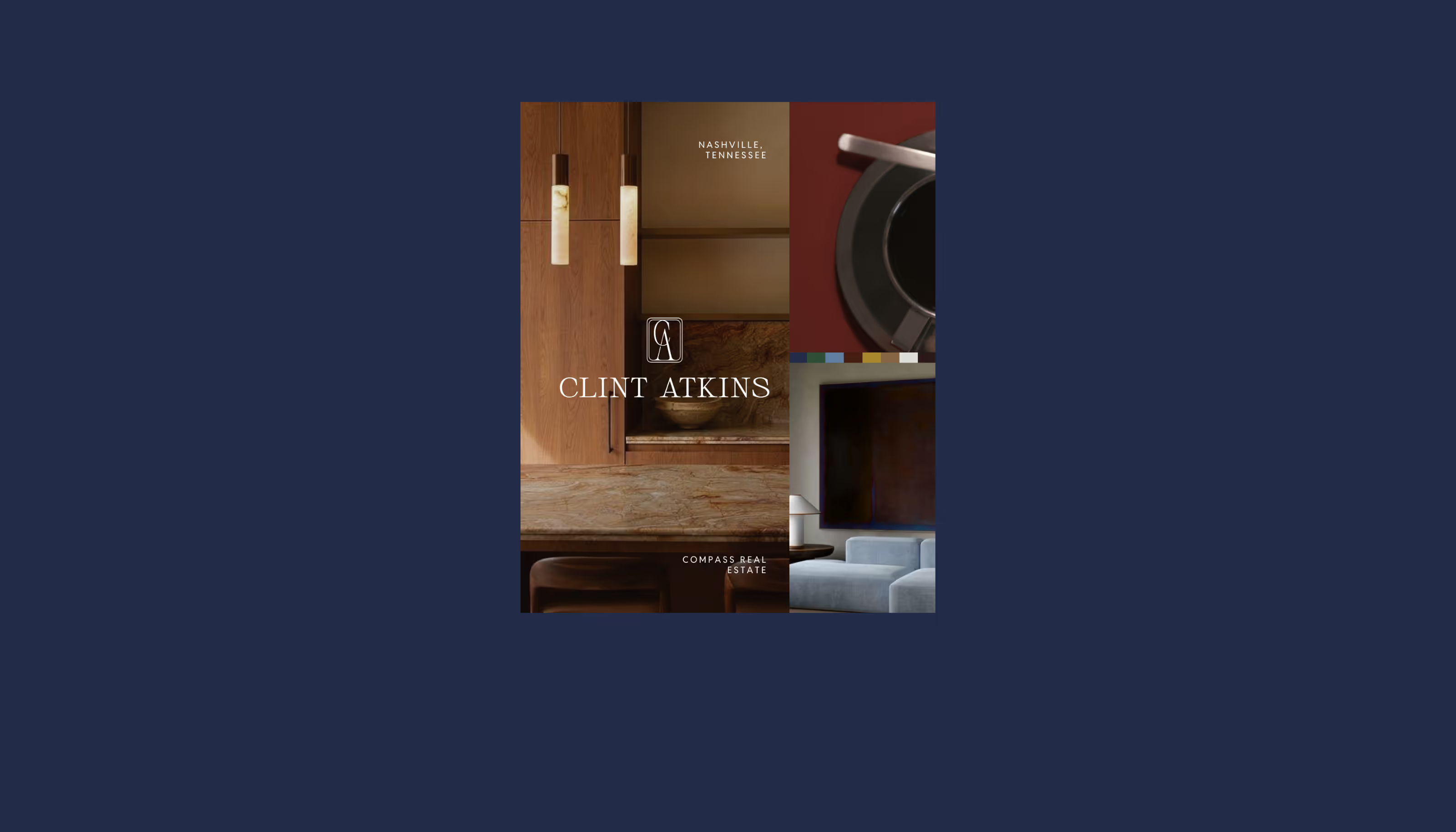

Clint Atkins is a Compass real estate agent focused on delivering a high-touch, relationship-driven experience for buyers and sellers. The goal of this project was to establish a refined visual identity that would support credibility, create consistency across touchpoints, and better reflect the level of service behind the brand.
We focused on building a clear system that felt grounded and trustworthy. The identity needed to feel confident without being loud or bold, striking a balance between professionalism and approachability.
.png)

Initial Exploration
We began by exploring two distinct concept directions to define the visual language of the brand.
The first concept was inspired by architecture and floor plans. It took a more structured, architectural approach, focusing on form and precision. To build trust in the brand, a strong frame for stability was a given, with slightly round corners to keep it approachable and relationship-driven.

A CA mark doubled to read as both a home exterior and bird's-eye floor plan.
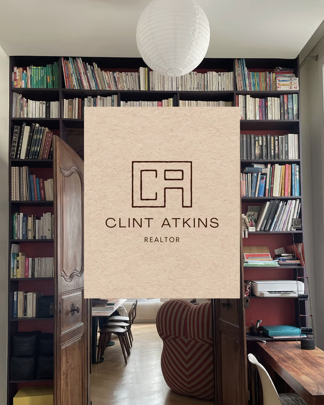
Clean, minimal, and modern — with a wholesome, earthy feel.
Re-direction
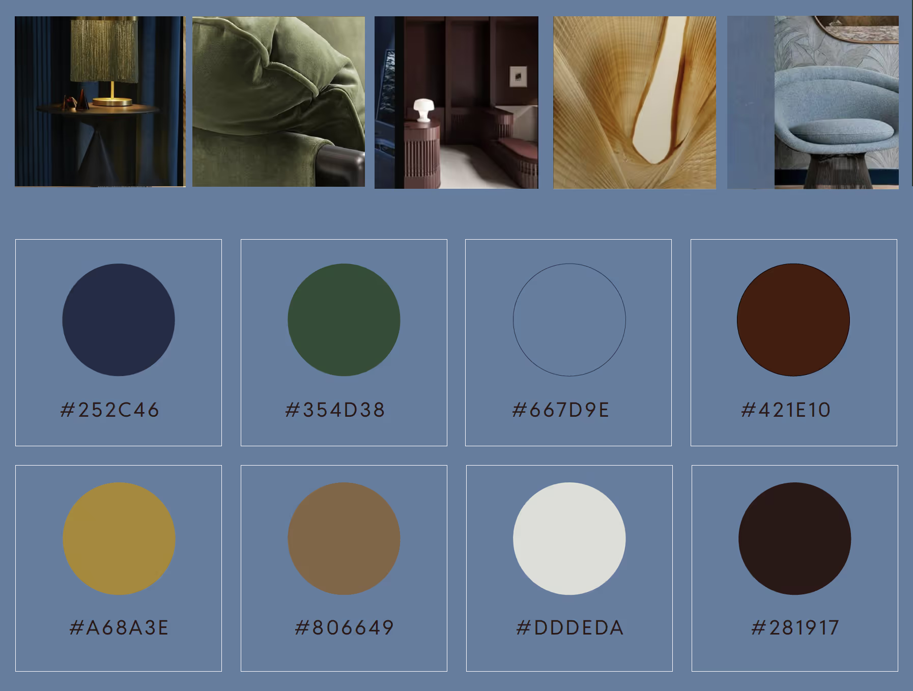
The second direction leaned more elegant and heritage, with a refined, relationship-driven tone rather than a literal or architectural interpretation of homes.
Presenting both early helped quickly clarify what felt aligned with the client’s positioning and what didn’t. From there, we refined the selected direction through typography, spacing, and system development, focusing on clarity, restraint, and consistency across applications.