.svg)
.avif)
.avif)
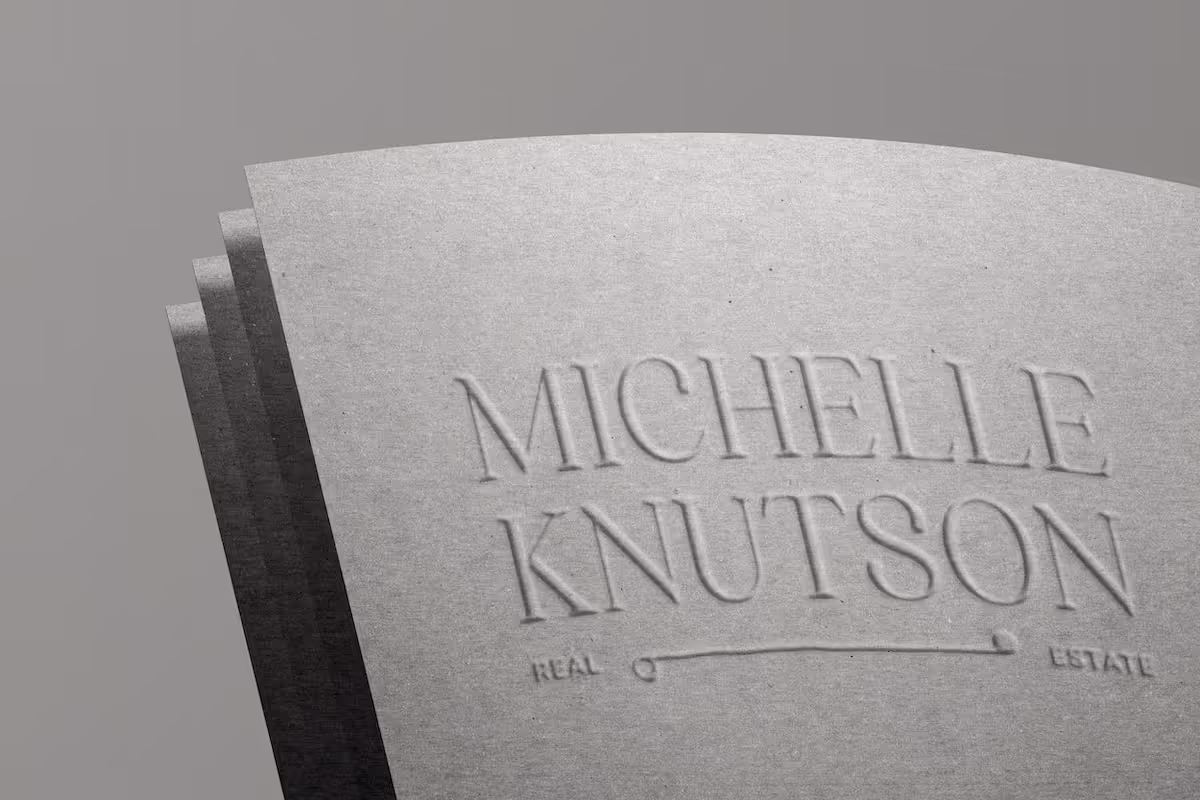
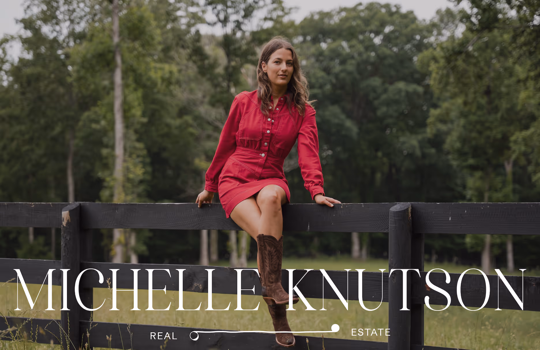
Luxury Lifestyle & Real Estate Visual Identity
Michelle Knutson Real Estate is a bi-coastal brand serving clients across California and Tennessee. As her business evolved, the visual identity needed to better reflect the level of experience, design sensibility, the caliber of homes she represents, and her lifestyle-driven point of view shaped by hospitality, fashion, and culture.
Elliworth developed a refined brand system and cohesive social presence that elevate her positioning, bringing clarity and consistency across every touchpoint.
.png)
The identity reflects both place and perspective. The logo centers on a symbolic journey: an open circle representing possibility at the starting point, an irregular organic line reflecting the non-linear nature of major decisions, and a filled circle signifying clarity and confidence at the destination. The palette draws from California and Tennessee—through muted coastal tones and deep, grounded neutrals. An editorial typographic system pairs a classic serif with a refined sans serif to create structure, clarity, and a distinct visual rhythm throughout the brand.
.avif)
.png)
.png)