.svg)
Strategic Branding & Web for Artist Representation Agency
Thompson Studio is Nashville's first visual artist representation agency. Founded by Kristen Thompson to handle the business side of artists' careers, artists can stay focused on creating. The engagement began with research and strategy, translating findings into a full brand identity, a landing page for soft launch, and marketing collateral — all speaking to two distinct audiences: established and emerging artists looking for representation, and buyers including private collectors, boutique hotels, interior designers, and editorial publications.
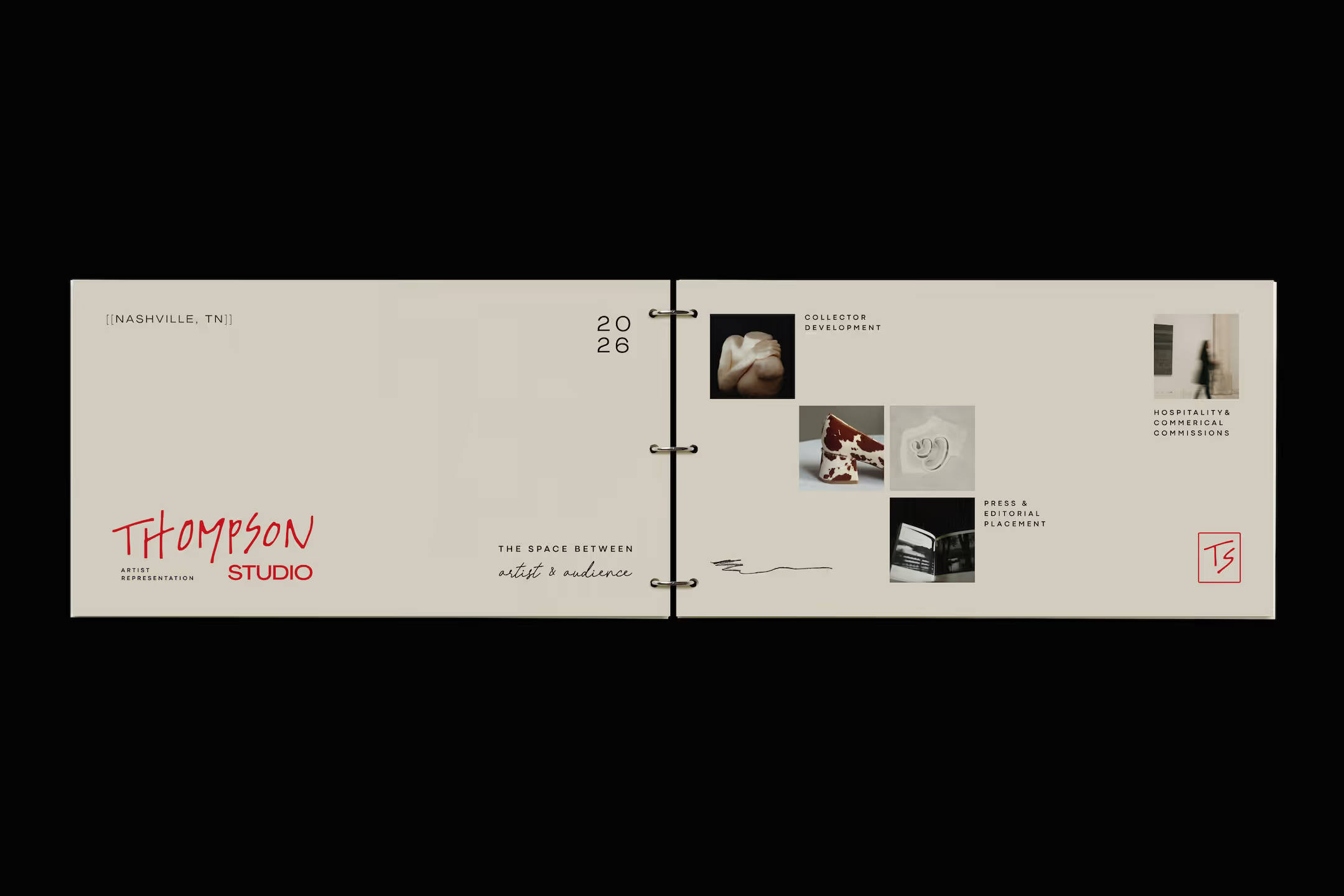
The process began with an in-person brand workshop with founder, Kristen Thompson, working through exercises to uncover her vision, positioning, audiences, and competitive landscape. Findings were synthesized into a strategy deck covering brand attributes, messaging framework, audience personas, and direction.
Creative direction was sourced intentionally. Pinterest was a starting point, but print (art books and publications) is where the references live that algorithms can't surface and nobody else is pinning.
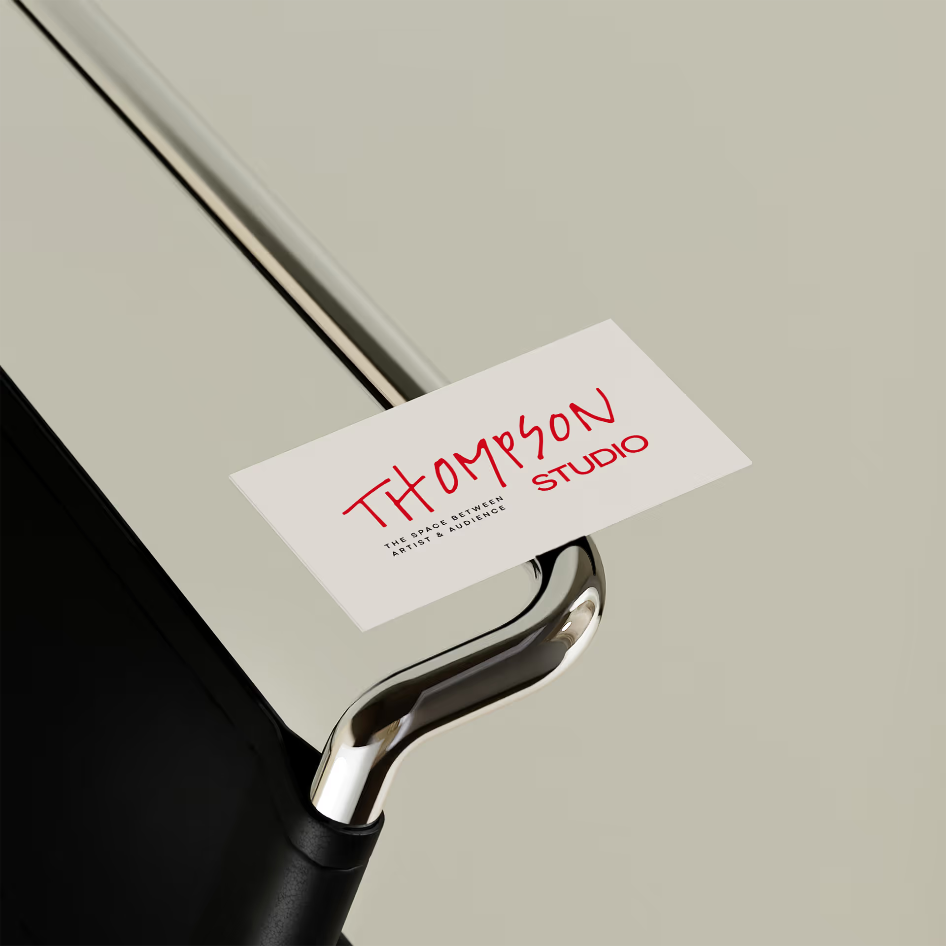
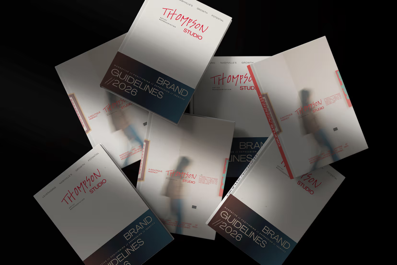
The brand's core expression: refined, editorial, contemporary with an organic edge. The logo was hand-drawn by design — Thompson Studio needed to feel sleek and modern, but also human and artist-adjacent. The final mark pairs the hand-drawn wordmark against a bold wide sans "STUDIO," landing where the brand called for: confident and grounded, with personality underneath.
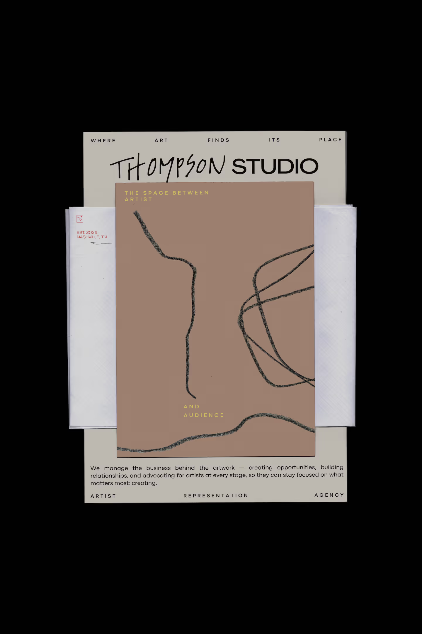
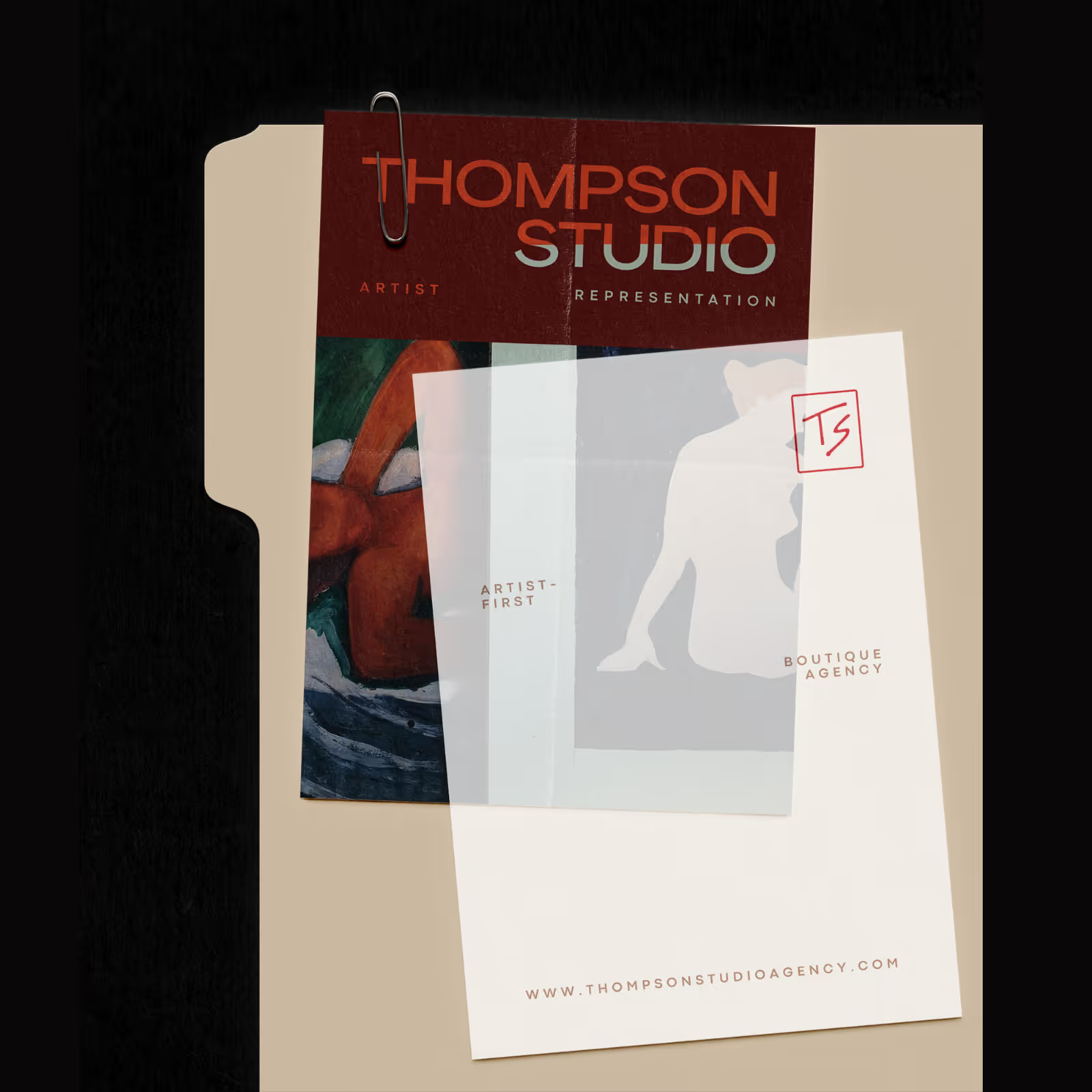
Tagline, messaging, and abstract illustrations expressed in stationary print.
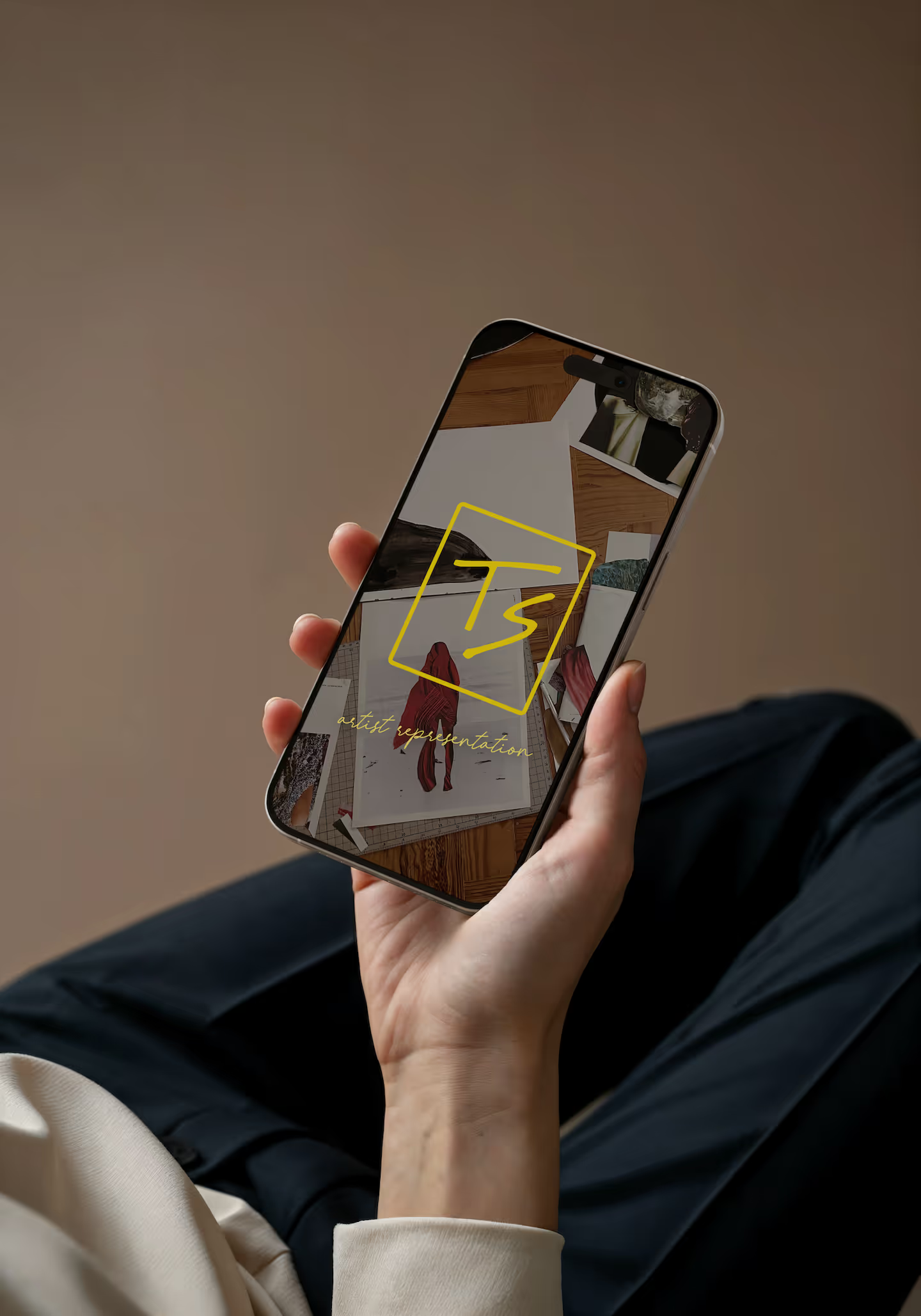
Logo system in use: logomark and accent type in an alternate color variation.
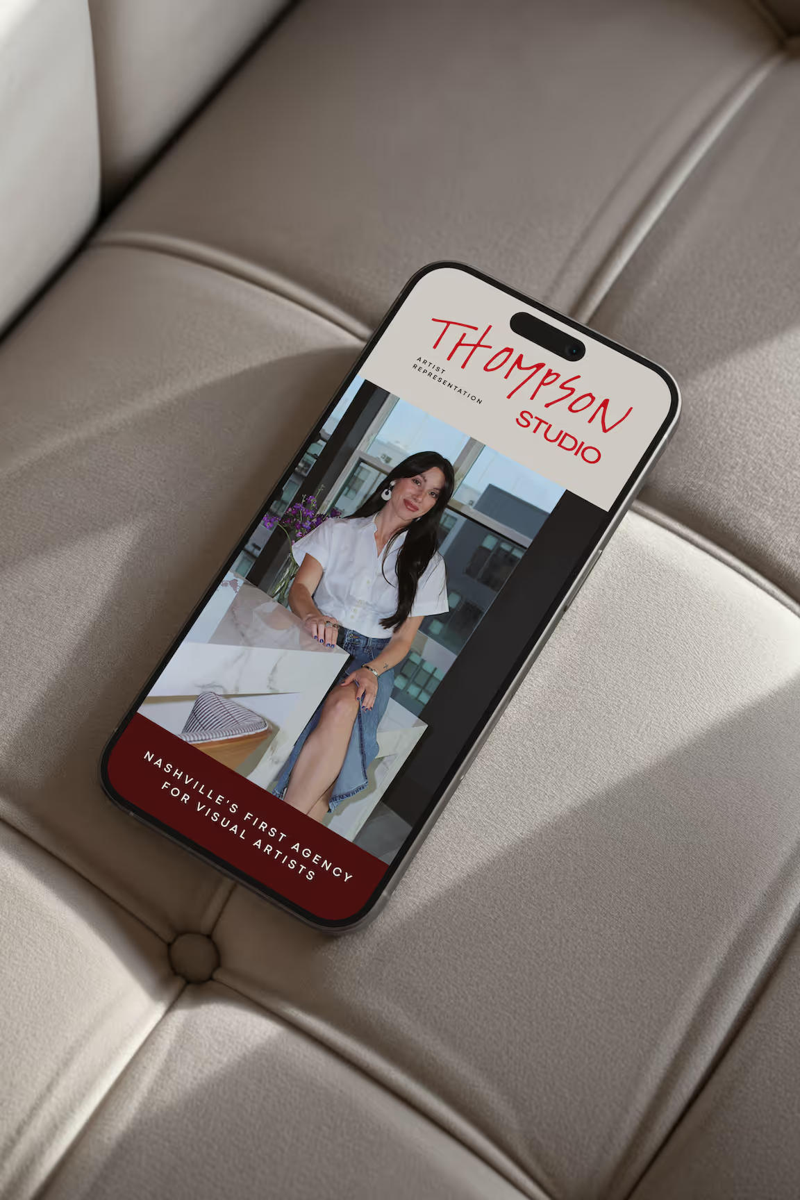
A face to the brand and a bold market claim: Nashville's first agency for visual artists.
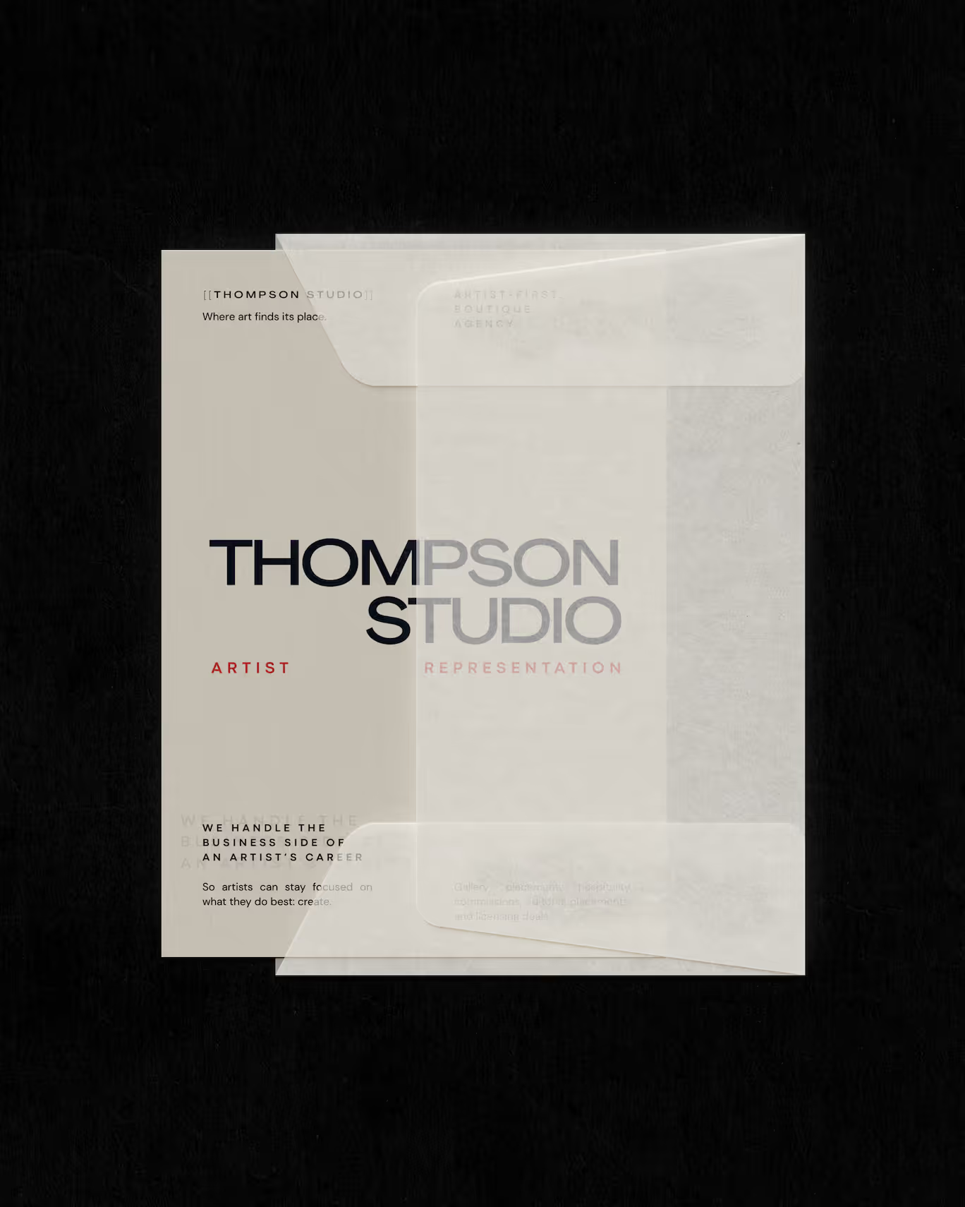
A secondary mark for moments that call for a more grounded expression of the brand.
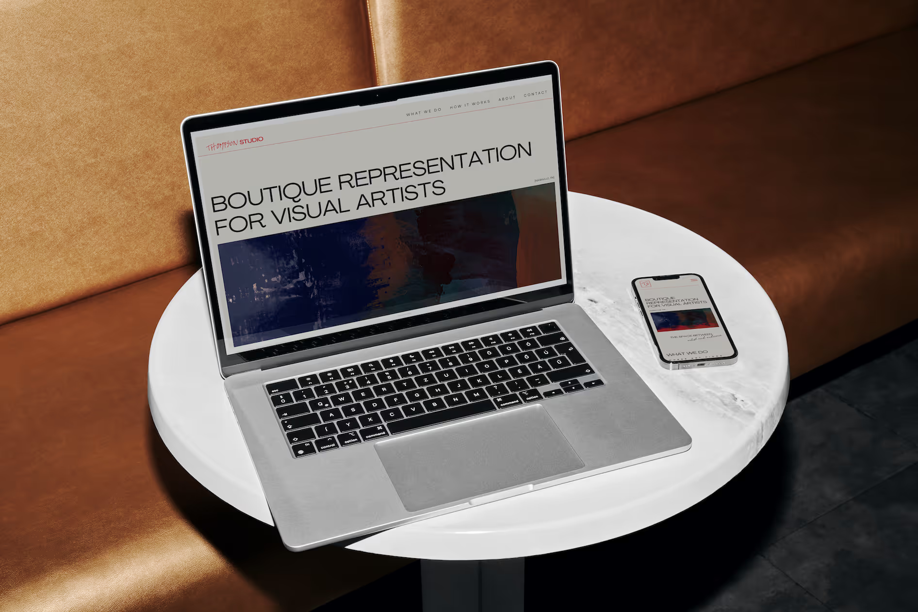
Web Design & Development
A soft launch presence to direct early interest and establish positioning. The page needed to communicate Thompson Studio's mission clearly and differentiate from traditional representation — for two audiences at once.
The layout is a clean, intuitive path through the page with the minimalism of a gallery wall and the structure of an editorial spread. Designed to be conversion-focused, the How It Works section runs parallel tracks for artists and buyers, giving each audience a clear entry point and messaging to how Thompson Studio connects the two worlds.
The page was also structured with search in mind, laying SEO groundwork for discoverability as Thompson Studio grows.

A subtle intro animation setting the tone before the page loads.
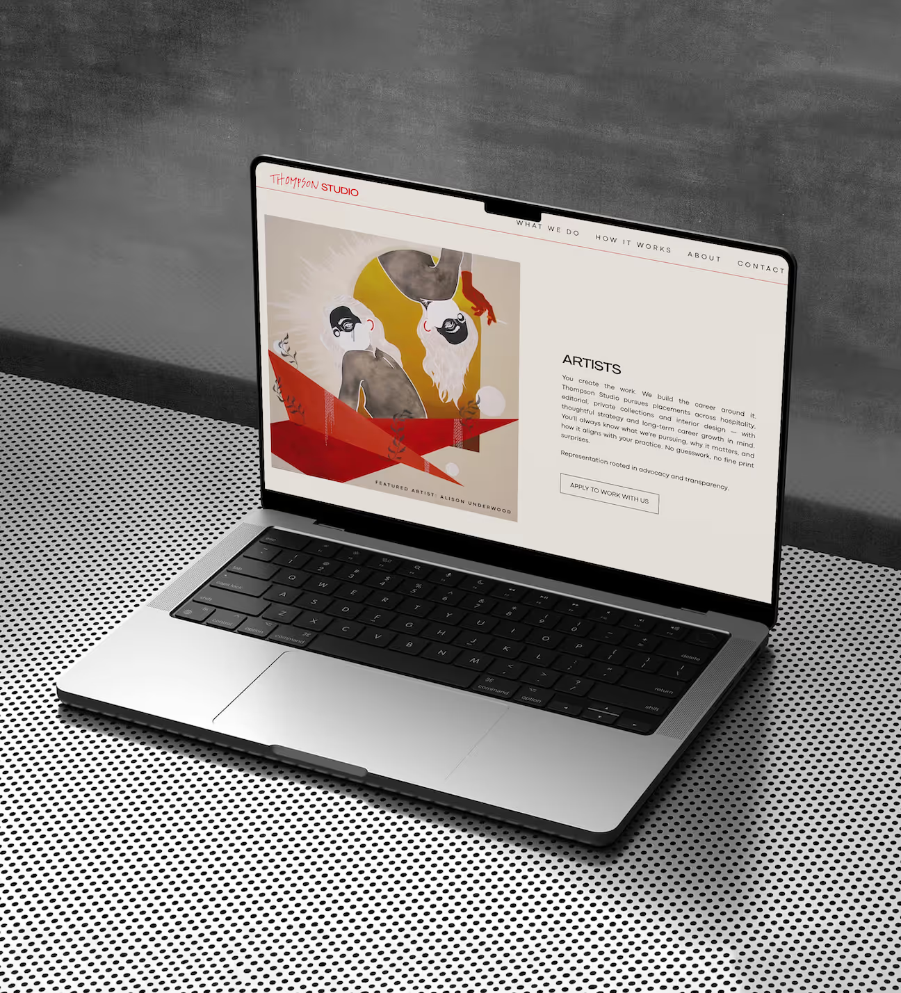
Artist-facing messaging: conveying Thompson Studio's commitment to advocacy, transparency, and long-term career growth.
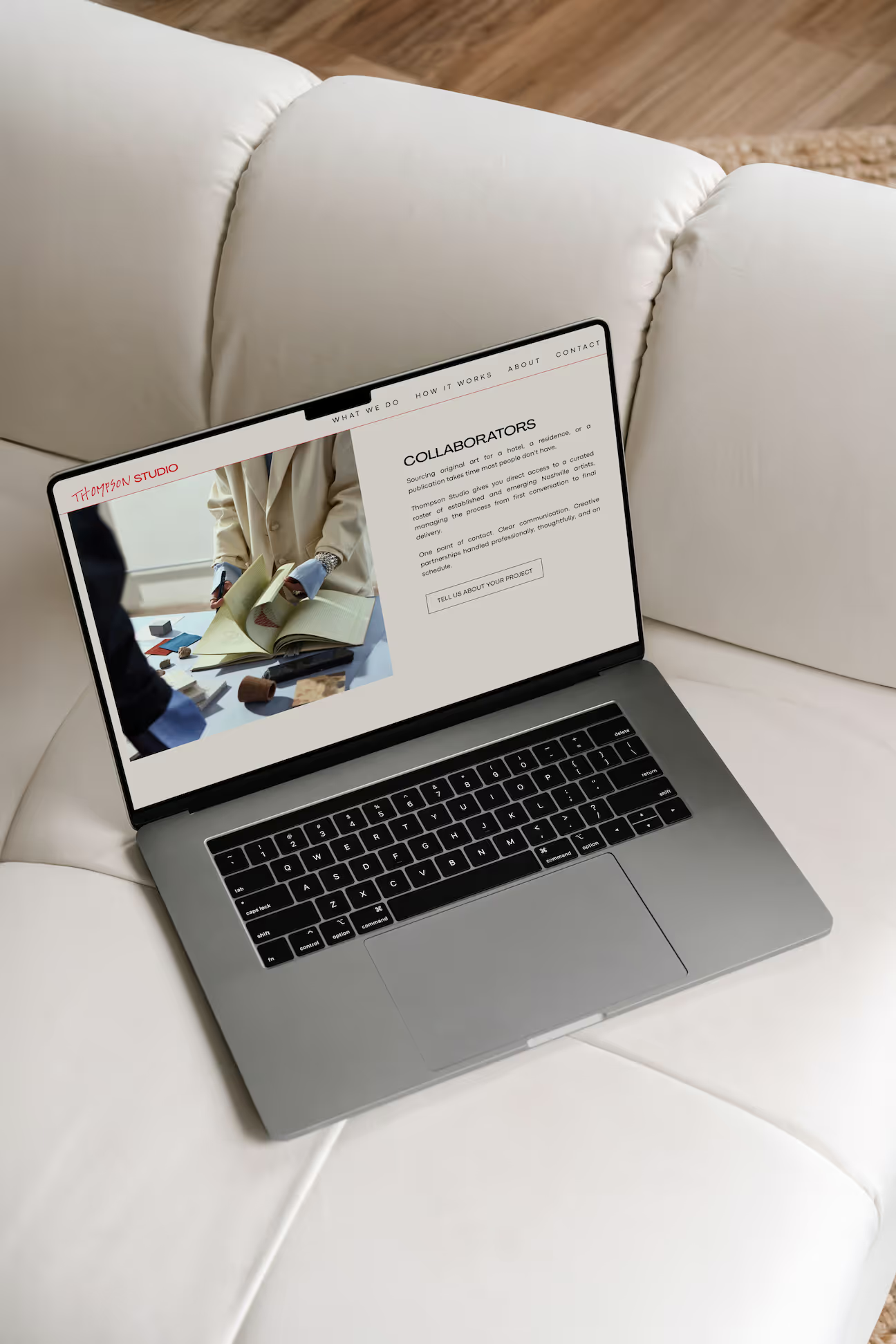
Buyer-facing messaging: positioning Thompson Studio as the efficient, professional bridge between collaborators/buyers and Nashville artists.
UX/UI, layout, and copy working together to guide two audiences through a single, cohesive experience.
client perspective
Communication was responsive and collaborative throughout the process, and the final deliverables were thorough and professional. Highly recommend for anyone looking for a design partner who really listens.”

.avif)